Branding
May 21, 2026

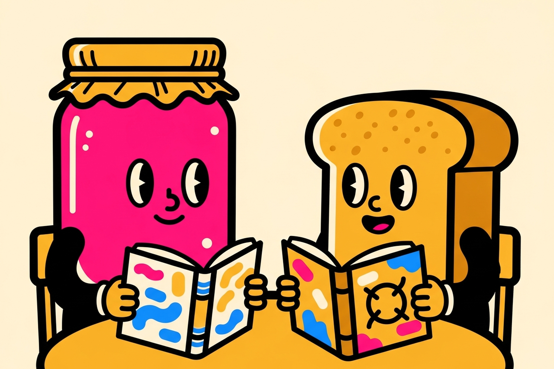
A brand book by itself does not keep your brand consistent. The people who have read it do.
That distinction matters because most brand book failures are not failures of content. They are failures of adoption. Someone spent three months building a beautiful 60-page brand guide, exported it as a PDF, sent it to the team, and six months later the marketing and sales decks look like they came from different companies.
A brand book works when it is built to be used, not built to be impressive. Here is what that means in practice.
A brand book is a reference document that defines how a brand looks, sounds, and behaves across every touchpoint. It is sometimes called a brand guide, brand standards document, or brand identity guidelines. The terminology varies but the purpose is the same: give anyone who creates brand materials a clear set of rules to follow so the output is consistent.
This is not the same as a brand strategy document. A brand strategy covers positioning, audience, and competitive context. A brand book covers execution: the specific visual and verbal rules that translate strategy into consistent outputs.
It is also not a mood board or a style reference. A mood board shows a direction. A brand book defines specific, actionable rules that leave less room for interpretation.
The distinction between a good brand book and an inadequate one is almost always specificity. Vague rules produce inconsistent output. Specific rules produce consistent output.
A complete brand book covers three areas: visual identity, verbal identity, and usage guidelines.
Logo. The complete logo system: primary version, secondary versions, logomark-only, wordmark-only, and any approved lockups. Clear specifications for minimum sizes, clear space requirements, and approved color variations (full color, one-color, reversed on dark backgrounds). Examples of incorrect usage are as important as examples of correct usage.
Color palette. Primary and secondary colors with exact values in every format needed: HEX for web, RGB for digital screens, CMYK for print, and Pantone for physical materials. Usage rules for each color: which ones are primary, which are accent, which can appear as backgrounds, and which combinations are approved or prohibited.
Typography. The type system: primary typeface, secondary typeface, fallback fonts for digital contexts where licensed fonts are not available. Hierarchy rules covering heading sizes, body copy sizing, line height, and how type scales across different formats. The typography in branding decisions made early have a significant compounding effect on brand recognition.
Imagery and photography. The visual style rules for photography: mood, subject matter, color treatment, composition conventions. What the brand's photography looks like and, importantly, what it does not look like. If you use illustration, the illustration style guidelines belong here too.
Iconography and graphic elements. Any recurring graphical elements, patterns, textures, or icon styles that appear across brand materials.
Brand voice. The personality and tone of the brand's writing. Not just adjectives ("we are direct and human") but examples of the same idea written in the brand voice versus out of the brand voice. The brand voice and tone section is the one most brand books either skip entirely or treat too abstractly.
Messaging hierarchy. The company description, tagline, and key messages in priority order. What do we say first, what do we say next, and what do we never say?
Audience language. Words and phrases the audience uses that the brand should adopt. Words and phrases the brand avoids. Category jargon that helps versus jargon that alienates.
Applications. How the brand elements apply to specific formats: presentations, email signatures, social media profiles, digital ads, business cards, and event materials. This section converts abstract rules into concrete, practical references.
Do and don't examples. Side-by-side comparisons showing approved applications alongside common mistakes. These are the most referenced section of any good brand book.
Too long to reference. A 90-page PDF that requires downloading and searching is not a reference document. It is a one-time read that collects dust. A good brand book surfaces the most-used information immediately and buries the edge cases. If the designer can not find the correct logo color in under thirty seconds, the document is not functional.
Aspirational rather than prescriptive. "We are warm and human" is an aspiration. "Our copy never uses passive voice and always addresses the reader as 'you'" is a rule. Brand books full of aspirational language create subjective standards that different people interpret differently.
Built for launch, not for ongoing use. A brand book written at the time of a rebrand captures the decisions made during that process. It rarely accounts for new formats, new platforms, or the edge cases that emerge as the brand lives in the world. The best brand books are living documents with a clear owner responsible for keeping them current.
No examples. Abstract rules require interpretation. Examples eliminate interpretation. Every verbal rule should show what it looks like in practice. Every visual rule should show the correct application alongside common mistakes.
The format matters as much as the content. A PDF that lives in a shared drive gets consulted once. A Notion page that is linked from every design brief, every new employee onboarding document, and every agency briefing actually shapes work.
Build it in the same tool your team already uses for reference. Keep it concise: most operational brand decisions can be addressed in under 20 pages. Link out to longer documentation for edge cases rather than trying to anticipate every scenario in the main document.
At Jamm, the standard is a brand book that fits in a single shared doc with a clear table of contents. It covers every decision a designer or writer needs without burying them in scenarios they will never encounter.
Jamm helps growing teams build brand books as a natural output of the design system work: the colors, typography, and component patterns developed during ongoing design work get documented into a reference that the whole team can use.
If you are starting from a fragmented brand or a rebrand, Book a call with Jamm and we will assess what you have and what you need.
A brand book written once and never updated is a snapshot, not a standard. Brands evolve: new products launch, new channels emerge, and new use cases arise that the original document did not anticipate.
A brand book that works long-term has a clear owner (usually the head of marketing or creative director), a review cadence (at minimum annually), and a lightweight process for proposing and approving updates.
The best brand books are not the most comprehensive ones. They are the ones that the team actually uses when they are making the next LinkedIn post, the next sales deck, or the next product announcement. Get them in front of the work, and keep them there.
Start your subscription and get your brand documented, consistent, and ready to scale.
Hire a team of top level professionals for less money than hiring a single designer. Stupid simple design subscription service to level-up your business!
Looking forward to potentially working with ya ✌️


