Branding
May 21, 2026

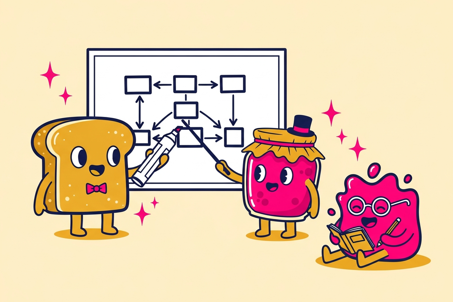
Most website projects start with the wrong question. Teams open Figma, pull up a competitor's site for "inspiration," and start designing a homepage. Then they design a services page. Then a blog. Then they realize nothing connects properly, navigation is a mess, and the content doesn't reflect how customers actually think about the problem.
By the time they notice, they're deep into design work that needs to be undone.
Website structure is what prevents that. It's the phase that happens before a single mockup is made, and it's probably the highest-leverage thing you can do to make sure your website actually works.
Website structure describes how your pages are organized and connected. It includes:
/services/web-design/ vs. /web-design/)These four things work together. Your navigation reflects your hierarchy. Your URLs should mirror your hierarchy. Your content groups should make the hierarchy feel intuitive rather than bureaucratic.
A well-structured site is one where a visitor lands on any page and instinctively knows where they are, how to get to what they came for, and where to go next. That doesn't happen by accident. It's the product of deliberate planning before any visual design begins.
There's a practical reason to get structure right before design: it's cheap to move boxes in a diagram. It's expensive to rebuild pages after a designer has spent twenty hours on them.
But there's a deeper reason too. Design decisions are downstream of structure decisions. The layout of your homepage changes depending on whether it needs to route visitors to three main sections or eight. The navigation component your designer builds depends on whether you have two tiers of hierarchy or four. The calls to action across your site depend on understanding the conversion paths you've mapped.
When structure comes after design, you end up retrofitting. You add pages in places they don't logically belong. Navigation gets patched with dropdowns and secondary menus that feel bolted on. The site grows, but it doesn't grow coherently.
Starting with structure also forces a useful conversation: what do we actually want this site to do? Not just "look professional" or "tell our story," but specifically: what actions should visitors take, what information do they need to get there, and in what order?
That conversation is much harder to have when there's already a beautiful homepage mockup on the screen. The visual work creates anchoring bias. Structure planning, done before design, keeps everyone focused on problems before solutions.
Here's a practical process for building your site architecture before design begins.
The most common mistake in site planning is organizing pages around how your company is structured internally. The "Our Team" page exists because someone wanted a page about their team. The services are listed in the order your sales team thinks about them, not the order a customer would.
Start instead with: what are the three to five things someone coming to this site is trying to accomplish? Common answers for a B2B company might be:
Every page on your site should serve one or more of those goals. If a page doesn't serve any of them, you need to ask why it exists.
Once you have visitor goals, you can define the page types your site needs. A simple framework:
Not every site needs all of these. A lean startup site might have eight pages. An enterprise site might have eighty. The point is to list what you need before you start designing anything.
With your page types defined, sketch the hierarchy. This doesn't need to be sophisticated. A simple outline works fine:
The questions to ask at this stage: which pages are top-level destinations? Which are supporting content that lives under a parent? Which pages are standalone (like Pricing or Contact) vs. part of a content cluster (like blog posts under Blog)?
Depth matters here. Most sites should not go deeper than three levels: Homepage > Section > Page. Every level of depth you add is another click a visitor has to make, and another chance for them to get lost or bounce.
Navigation is the visible expression of your hierarchy. But it's not a one-to-one mirror of it. You have to make choices: what goes in the main nav, what goes in the footer, and what lives only in contextual links within page content.
The main nav should include only the things most visitors need most of the time. When in doubt, fewer items in the main nav is better. Research consistently shows that navigation with five to seven items performs better than navigation with ten or twelve, because visitors can scan and choose quickly rather than hunting.
URL structure gets overlooked in planning and causes real pain later. Decide early: will service pages live at /services/web-design/ or just /web-design/? Will blog posts live at /blog/post-slug/ or /insights/post-slug/?
Keep URLs short, descriptive, and consistent. Avoid folders that exist only for organizational reasons if they add length without adding meaning. And once your URLs are set and indexed, changing them is a real SEO cost.
Navigation that reflects internal priorities, not visitor needs. If your nav has "About," "Our Story," "Team," and "Culture" as separate top-level items, you're using your website to organize your org chart. Visitors don't care about internal hierarchy.
Services pages that can't be found. Many companies have individual service pages that are never linked from the homepage or nav, only from the footer or a sitemap. If a page isn't a click or two from the homepage, it might as well not exist for most visitors.
Duplicate or competing pages. This happens when teams create pages over time without an architecture plan. You end up with /web-design-services/ and /our-web-design-work/ targeting the same keyword from different angles, confusing both visitors and search engines.
Flat architecture that buries content. When everything is one click from the homepage, the homepage becomes the navigation, which creates its own mess.
These two outcomes are tightly linked, and both flow from the same structural decisions.
For SEO: search engines use your internal link structure to understand which pages are most important. Pages that are linked from your homepage and top navigation get more crawl priority than pages buried three levels deep with no internal links. Your URL structure signals topic relevance. When pages are organized into clear topical clusters (all web design content under /web-design/, all branding content under /branding/), search engines can understand your topical authority more clearly.
For UX: structure determines how easily visitors can orient themselves and complete their goals. A visitor who lands on a blog post should be able to get to your pricing page in two clicks. A visitor who lands on your homepage should be able to understand what you do without reading a word. Both of those outcomes are structure problems, not design problems. You can't fix them with better typography or color choices.
Good site structure creates the conditions for good design. Design can make those conditions feel effortless or it can highlight gaps in the structure. It can't substitute for structure that isn't there.
Before Jamm's team touches a single visual for a web design project, there's a structure conversation. What pages does the site actually need? How should conversion paths work? What's the hierarchy? This isn't bureaucratic process for its own sake. It's what makes the design work faster and the final site perform better.
Book a call if you're planning a website build or redesign and want to get the structure right before design begins.
For teams who want a deeper look at what makes B2B sites work beyond structure, the post on B2B web design principles is worth reading alongside this one. And if you want to understand the full process of designing a site from planning through launch, the guide on designing a website step by step covers the complete picture.
Good structure is unglamorous work. Nobody hands out awards for a well-organized sitemap. But it's the difference between a website that's a pleasure to use and one that quietly frustrates everyone who lands on it, including you, six months after launch, when you're trying to figure out why it isn't converting.
Do the unsexy work first. The rest gets much easier.
Start your design subscription and get senior design support for your next website project, from structure and planning through to final build.
Hire a team of top level professionals for less money than hiring a single designer. Stupid simple design subscription service to level-up your business!
Looking forward to potentially working with ya ✌️


