Branding
May 21, 2026
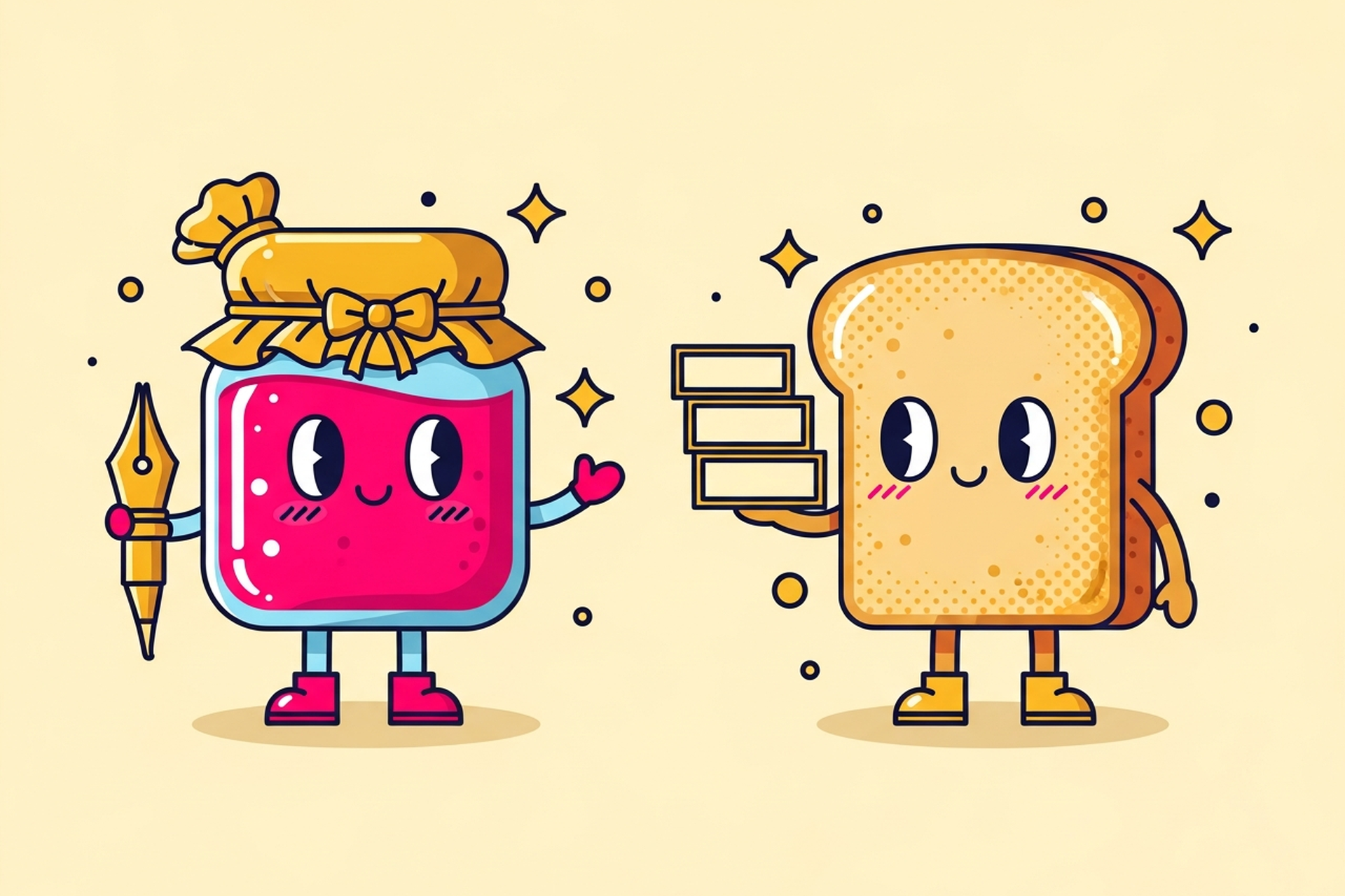
Nobody reads a brand's font. They feel it.
That's the thing about typography in branding that's hard to explain to founders who haven't thought about it before. Your font choice isn't just a readability decision. It's a personality signal. It communicates trustworthiness, playfulness, authority, warmth — all before a single word registers consciously.
And most early-stage brands get it wrong by either ignoring it completely (default system fonts, here we come) or picking something that looks pretty without thinking about what it actually says.
Let's change that.
Font choice influences up to 90% of consumer purchasing decisions, often at a subconscious level. That's not a readability stat — that's a perception stat. People make judgments about brands through their typography the same way they make judgments about people through their clothes.
A law firm in a casual rounded sans-serif reads as unprofessional. A kids' toy brand in a rigid geometric sans-serif reads as cold. The mismatch creates friction, a tiny wrongness that people can't name but respond to. You lose the sale and they don't know why.
Appropriate font choices can increase conversion rates by 35%. The converse is also true. Bad font choices convert less, earn less trust, and make you look like you haven't thought through your brand.
This stuff matters.
Let's keep this practical.
Serif fonts have those small finishing strokes at the ends of letter forms — the little feet. Think Times New Roman, Georgia, Garamond. Serifs read as established, trustworthy, traditional, authoritative. Three-quarters of Fortune 500 companies use sans-serifs for their logos now, but most serious editorial and legal brands still lean serif because it signals depth and credibility. Research shows serif fonts increase perceived trustworthiness by 40%.
Sans-serif fonts are clean, modern, straightforward. No finishing strokes. Think Helvetica, Futura, Inter. They read as approachable, modern, efficient. Tech companies default here for a reason — it says "we're current, we're clean, we don't have time for fussiness." Three-quarters of Fortune 500 logos are sans-serif. It's become the de facto language of competence.
Display and script fonts are expressive, personality-forward, and harder to use well. Scripts read as human, warm, artisanal, personal. Custom display fonts signal that you've invested in your identity. Both can be powerful in the right context and disasters in the wrong one. These fonts earn trust through confidence — they only work if they're executed with precision.
There are also slab serifs, monospace fonts, and variable fonts worth knowing about, but for most brand work, you're making decisions within these three buckets first.
Before you pick anything, answer these questions:
What feeling should someone have in the first three seconds of reading your name? Trust? Excitement? Calm? Sophistication? Fun?
What category context are you working in? Financial services fonts and streetwear brand fonts are playing very different games. You can break category conventions, but you should do it intentionally.
How much text will you be setting? A logo font and a body copy font are different jobs. A font that's striking at 72pt may be unreadable at 12pt. Your brand system needs at least two fonts: one for display/headlines, one for body.
What does your closest competitor use? This isn't so you can copy them — it's so you can differentiate. If your category is full of geometric sans-serifs, maybe your serif is the visual differentiator that makes you immediately distinctive.

Single fonts rarely carry an entire brand. You need a system — and pairing is where most non-designers go wrong.
The general rules:
Contrast, don't compete. A serif headline paired with a sans-serif body is classic and works because the contrast creates hierarchy. A serif headline with a different serif body creates visual noise — they're too similar to feel intentional.
Match the weight of personality. A heavy display font with a delicate light-weight body feels unbalanced. Both fonts should be pulling in a similar emotional direction even while creating visual contrast.
Check the x-height. This is the relative height of the lowercase letters. Fonts with different x-heights can feel mismatched at similar sizes even when they contrast well in other ways.
Three is usually too many. Most brand systems can do everything they need with two typefaces: one display/headline, one body. Add a third only if there's a specific functional reason — like a monospace font for code samples on a developer tools product.
The typography choices that look effortless are usually the ones someone agonized over. The brands that "just look good" have a typographer somewhere in their history who made very specific decisions. If you want someone to look at what you've got and give you an honest read on whether it's working — that's a quick conversation.
Using free fonts without checking licensing. A lot of "free" fonts from font aggregator sites are only free for personal use. Using them commercially exposes you to infringement claims. Always check the license. Google Fonts are generally safe for commercial use, but read the specific font's license anyway.
Stretching or condensing fonts manually. This is a graphic design sin. If you need a condensed version of a typeface, get the actual condensed variant of the font family. Manually stretching distorts the letterforms in ways the type designer never intended, and experienced eyes will notice.
Too many weights, used inconsistently. A font with many weights (thin, light, regular, medium, semibold, bold, extrabold) looks great in a specimen. In practice, using all of them across your brand creates hierarchy chaos. Pick two or three weights and use them consistently.
Reversing out tiny text. White text on a dark background increases perceived contrast but actually reduces legibility at small sizes for most fonts. If your body copy is going reversed, test it at actual size before committing.
Ignoring line-height and letter-spacing. Two identical fonts set with different line-height feel completely different. Tight line-height reads as dense and claustrophobic. Loose reads as airy and editorial. This setting is part of your typography system even if most brand guides ignore it.

Here's the operational reason typography matters beyond the aesthetic one.
Every piece of content your brand produces is a typography decision. Every slide deck. Every email. Every social media graphic. Every investor pitch. Every piece of swag.
Without a documented typography system — which fonts, which weights, which sizes for which purposes — each of those decisions is made ad hoc. By whichever team member is creating that piece of content that day. On whatever software they have access to.
This is how brand consistency falls apart. Not dramatically, in a way anyone notices immediately. But gradually, through accumulation of small inconsistent choices, until the sum total of your brand materials looks like it was produced by five different companies.
83% of designers acknowledge the importance of distinct and memorable font styles in brand identity. What they're really acknowledging is that typography is one of the primary vehicles through which brand consistency is either built or eroded.
A documented typography system — this font for headlines, this one for body, these weights for these purposes, these sizes at these breakpoints — gives your team a framework to work within. The individual pieces stop being font decisions and start being brand expressions.
At Jamm, typography is built into every brand identity project we take on. It's not a line item — it's foundational. Unlimited design requests, flat monthly rate, senior designers, turnaround in about two business days. The font choices are ours to sweat so you don't have to.
Your font is saying something. Make sure it's saying the right thing.
Hire a team of top level professionals for less money than hiring a single designer. Stupid simple design subscription service to level-up your business!
Looking forward to potentially working with ya ✌️

