Branding
May 21, 2026

Color is the first thing people notice and the last thing most founders think strategically about.
You picked your brand colors because they looked good. Maybe because your designer suggested them. Maybe because you just liked them. That's fine — that's how most brand colors get chosen.
But "looks good" isn't actually the goal. The goal is colors that work. Colors that make people feel something specific, read as trustworthy or exciting or premium or approachable, and scale cleanly from your website to a business card to a hat at a trade show booth.
That's what brand color psychology is actually about. And most founders either oversimplify it ("blue means trust, red means energy") or overcomplicate it into analysis paralysis. Let's cut through both.
Color influences up to 90% of an initial impression. That's not a design statistic — that's a business reality. Before someone reads your headline, before they parse your offer, they've already formed a feeling from your colors.
That feeling is doing a job. It's pre-loading expectations. A financial services company in deep blue sets one expectation. A financial services company in bright orange sets a different one. Neither is wrong — but they're not interchangeable, and the mismatch between color and positioning confuses people in ways they can't articulate.
85% of customers identify color as a primary reason for choosing one brand over another. That's the lever. The question is whether you're pulling it intentionally.
Let's do the quick rundown — not because these associations are absolute truths, but because they're the cultural shorthand your customers are already working from.
Blue is the most used color among major brands for good reason. It reads as trustworthy, stable, competent. When you're not sure what to do, a lot of companies default to blue. It's also, increasingly, the color of tech startups that want to seem serious without feeling stuffy.
Red reads as urgent, passionate, energetic. It triggers action. That's why it shows up in clearance sales and food brands (it literally stimulates appetite). If you want people to move fast, red helps. If you want them to feel calm and considered, it fights you.
Green signals health, growth, sustainability, money. It's having a particular moment because of the sustainability wave — a lot of brands that weren't previously green have migrated toward it to signal environmental values.
Yellow/gold is optimistic, warm, attention-grabbing. It's very hard to ignore yellow, which makes it great as an accent and tricky as a primary color. Gold specifically reads as premium, which is why luxury brands lean on it.
Purple historically signals luxury and creativity. It's underused among major brands (only about 0.8% use it as primary), which means it can actually help you stand out if your positioning supports it.
Black/white/gray are versatile and timeless. Black reads as premium when used well. A grayscale-forward brand is making a statement about restraint and confidence. These are safe choices that can be either sophisticated or boring depending entirely on execution.
Here's where the "blue means trust" logic breaks down. Color doesn't work in isolation — it works in context.
The same shade of blue that says "trustworthy bank" on a financial services site says "sterile" on a wellness brand and "cold" on a food product. Context includes your industry category, your competitors' palettes, your target customer's expectations, and your own positioning.
This is why color psychology in branding is more nuanced than a lookup table. You're not just choosing a color that means the right thing in the abstract. You're choosing a color that means the right thing in the specific context of your category and customer.

Most brands need four types of color in their palette:
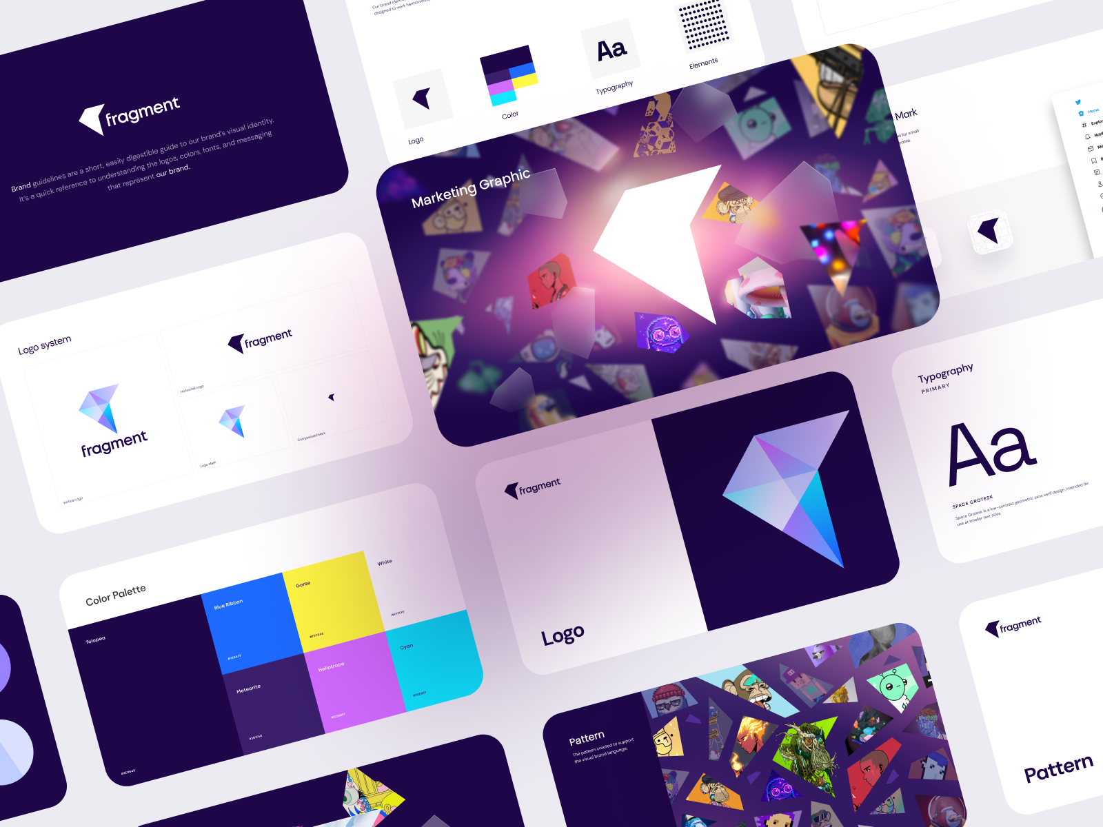
A primary brand color. This is your hero. It's what shows up in your logo, your primary CTAs, your dominant backgrounds. It should be distinctive in your category, legible at small sizes, and reproducible consistently across digital and print.
One or two secondary colors. These support the primary and add visual interest without competing with it. They're what you reach for in illustrations, in info graphics, in design elements that need to differentiate from the primary.
A neutral. Usually a dark near-black and a light near-white. These anchor everything. They give your eye somewhere to rest. Don't skip this — brands that skip neutrals end up with palettes that are exhausting to look at.
An accent. High contrast, used sparingly. This is your "look here" color — your badges, your highlights, your call-to-action buttons when you want maximum click-pull. The accent color should pop against everything else in your palette.
That's a functional palette. Four to six colors total. Anything more and you start losing coherence.
A palette isn't ready until you've tested it across every context it'll live in. That means:
Digital screens — does it render accurately on both bright laptop screens and dimmer mobile screens? Colors can shift.
Dark mode — does your palette have a dark mode version or at minimum an answer for when your interface is presented on a dark background?
Print — digital colors (RGB) don't translate directly to print (CMYK). Your hot pink might come out salmon on a business card. Always get printed proofs before locking a palette.
Small sizes — your logo color combo needs to be legible at 16px and readable as a favicon. Low contrast color combinations that look beautiful at full size become invisible at small sizes.
Accessibility — WCAG contrast requirements aren't just a legal obligation for some companies; they're also a signal that your palette works for a wider range of users. Check your primary text/background combinations.
Greyscale — if your brand is stripped of color entirely, does it still hold? This matters for photocopies, faxes (yes, some industries still fax), and contexts where color reproduction isn't guaranteed. If you want eyes on your current palette — whether you're building from scratch or you suspect something's not quite right — we're happy to take a look.
Chasing trends. Colors go in and out of fashion faster than you think. The millennial pink moment. The gen-z yellow moment. Gradient everything. If your brand color choice is mainly driven by what's popular right now, you'll be rebranding in three years. Choose something with longevity.
Copying your closest competitor. Brand color differentiation is actually a competitive advantage. If you and your top competitor are both blue, you're making the customer's job harder. Same color family, same category, same general aesthetic — how are they supposed to know which one to pick? Differentiate.
Palette sprawl. Every time someone adds "just one more color" to the palette, it gets slightly harder to maintain brand consistency. More colors means more decisions, more variance, more chances for something to feel off. Constrain the palette.
Ignoring cultural context. If you're marketing internationally, color meanings shift significantly across cultures. White means purity in many Western contexts; it's associated with mourning in parts of East Asia. Do the homework before you expand.
Color doesn't exist alone. It works in conversation with your typography, your photography style, your illustration approach, your whitespace decisions.
A brand with bold, saturated primary colors might pair with a clean geometric sans-serif typeface and plenty of whitespace to stop the palette from feeling overwhelming. A brand with a muted, earthy palette might lean into warm photography and organic textures to reinforce the feeling.
Getting this right — where every visual element is making the same argument — is what separates a brand system from a folder of assets. It's what makes a brand feel intentional and trustworthy even before someone reads a word.
At Jamm, color decisions are part of a larger conversation about your brand system — not a standalone exercise. That's how we build palettes that hold up: not just pretty on a slide, but working hard across every single touchpoint, from a website hero to a swag sticker on someone's laptop. Flat monthly subscription, senior designers, about two business days per deliverable. That's the deal.
Your colors are saying something right now. The question is whether they're saying what you want them to say.
Hire a team of top level professionals for less money than hiring a single designer. Stupid simple design subscription service to level-up your business!
Looking forward to potentially working with ya ✌️

