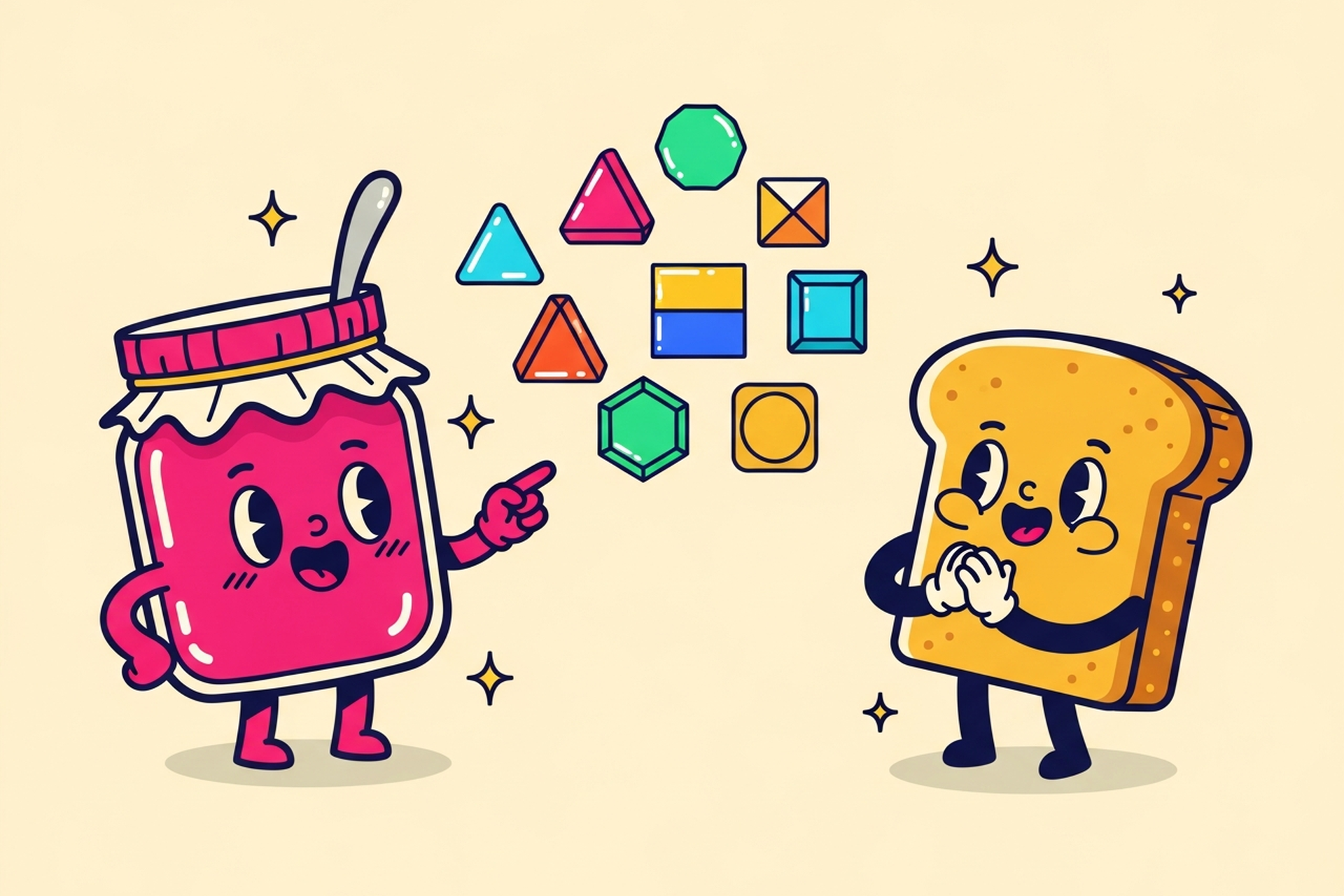
Branding
May 21, 2026
At some point in your startup journey, someone's going to say something like "your UI needs work," and if you're not a designer, you might smile and nod while having absolutely no idea what that means or what to do about it.
That's what this post is for. A genuine, jargon-free answer to "what is UI design," why it matters more than founders typically think, and what to actually do about it when your product's interface isn't pulling its weight.
UI stands for user interface. The user interface is everything a person sees and interacts with on your screen: buttons, menus, typography, colors, icons, spacing, forms, modals, cards, tables, charts. All of it.
UI design is the practice of making those elements look right, feel right, and work together as a coherent visual system. It's the difference between a product that looks professional and one that feels like it was bolted together from three different libraries by three different people on three different days.
Good UI is often invisible. When it's working, users don't notice it. They just feel like the product is easy to use. Bad UI is very visible. It's the button that doesn't look clickable, the text that's too small on mobile, the form that has no visual hierarchy, the color scheme that makes your product feel like a 2009 enterprise app.
How elements are sized, weighted, and positioned to communicate what matters most. Visual hierarchy in UX is the design principle that guides the eye through a screen in the order of intended importance. A well-designed screen guides the eye naturally: headline first, then subtext, then action. A poorly designed screen dumps everything at the same visual weight and makes users work to figure out where to look.
Font choices, sizes, weights, line heights, and spacing. Typography is one of the most underrated parts of UI design. The right type system can make a product feel modern, trustworthy, and readable. The wrong one makes text feel cramped or amateurish even if the content is excellent.
Not just "pick a brand color and use it everywhere." A proper UI color system defines primary and secondary colors, neutral grays for backgrounds and text, semantic colors for states (success green, error red, warning yellow), and how all of these interact across different surfaces and themes.
Buttons, inputs, dropdowns, modals, checkboxes, tooltips: these are the atoms of your product's interface. Good UI design means these components are consistent, clearly communicating their state (default, hover, active, disabled, error), and feel cohesive as a system. Nielsen's usability heuristics are a useful benchmark for evaluating whether your component states actually communicate what they need to.
The grid your interface sits on. How much breathing room elements get. How density changes on mobile vs. desktop. Spacing is one of those things that non-designers rarely articulate but always feel. A tight, cluttered layout feels cheap and stressful; a well-spaced one feels premium and calm.

This one trips founders up all the time. The short version:
UX is closer to architecture. UI is closer to interior design. Both matter. You can have a great UX with terrible UI (product flows well but looks unpolished) or great UI with bad UX (looks beautiful but users can't figure out where anything is). Neither is good.
We've written a full UI vs. UX breakdown if you want to go deeper on that distinction. For most early-stage founders, the practical answer is: you need someone who can do both, or two people who collaborate closely.
This is where founders sometimes get tripped up. "It's a startup, people care about the product working, not what it looks like."
That's partially true and mostly wrong.
First impressions are instant. Research consistently shows users form opinions about a product's credibility in milliseconds. If your UI looks rough, users assume the product is rough, regardless of whether the underlying functionality is excellent.
UI affects conversion, not just aesthetics. A well-designed onboarding screen, pricing page, or upgrade prompt converts better than a messy one. This isn't subjective. It's measurable. Hierarchy, button design, and visual clarity directly affect whether users take action.
Bad UI causes support load. When users can't figure out where to click, what a button does, or why an error occurred, they email support instead of solving it themselves. This is often invisible cost that founders don't connect back to design quality.
UI signals credibility to investors and buyers. In B2B especially, the look of your product factors into whether someone trusts it enough to sign a contract. A polished UI communicates "we take this seriously." A sloppy one communicates the opposite.
Most UI problems at early-stage companies come from the same few places:
Using components inconsistently. A button with rounded corners on one screen and sharp corners on another isn't a small thing. It signals that no one is maintaining the design system. Users notice this as "something feels off," even if they can't name it.
Ignoring mobile. Founders often design and test on their own laptops. Real users frequently arrive on phones. A layout that looks great at 1440px can be completely broken at 390px. Test at real mobile sizes before you ship.
Overcrowding screens. The instinct to show more functionality is understandable; you're proud of what the product does. But dense, feature-loaded screens overwhelm users and slow adoption. Start with less. Add based on usage data, not assumptions.
Skipping empty and error states. New users always hit empty states: no data yet, no activity, nothing to show. If you haven't designed what that looks like, it's often a jarring blank screen that makes the product feel broken. Design the empty state as carefully as the full one.
Good UI doesn't mean flashy. It means:
The benchmark isn't "does it look cool." It's "does a new user know what to do next without being told?"
That's a bar you can actually test. Watch five real users try to complete a core task in your product without assistance. If three of them hesitate at the same screen, that's a UI problem, not a user problem.
Most early-stage startups don't need a full-time UI designer. What they need is access to senior-level UI thinking on demand: someone who can overhaul the component library when you're about to raise, polish the onboarding flow before a big campaign, or rebuild the dashboard so users actually understand it.
That's exactly how Jamm works. Unlimited design requests, flat monthly rate, with senior designers who ship in around 2 business days. Founders use us to punch way above their weight on UI without the overhead of hiring full-time or the unpredictability of project-by-project agencies.
Want to see examples? See our work. Or if your UI is due for a rethink, book a call and we'll figure out where to start.

Hire a team of top level professionals for less money than hiring a single designer. Stupid simple design subscription service to level-up your business!
Looking forward to potentially working with ya ✌️

