Branding
May 21, 2026
Website illustration affects engagement in measurable ways, but not uniformly. The assumption that custom illustration always improves conversion misses a more nuanced truth: illustration improves engagement where it provides what the viewer needs, and hurts it where the viewer needs something illustration can't provide.
Here's how to think about where custom art creates value on your site — and where it doesn't.
The mechanism is straightforward: illustration captures attention through distinctiveness. A viewer who has seen thousands of stock photos develops rapid pattern recognition that processes and dismisses familiar imagery without conscious attention. A custom illustration breaks that pattern because it's genuinely novel.
Second, illustration creates emotional context. A well-designed character illustration on a SaaS homepage communicates warmth, approachability, and brand personality in ways that a product screenshot or abstract gradient cannot. For products where the purchase decision involves trust (you're buying access to someone's design, or their SaaS tool will live in your core workflow), that emotional context matters.
Third, illustration communicates specificity. The right illustration can show exactly the scenario you're describing — the specific frustration before your product, the specific transformation after — in a way that no photograph could capture.
Spot illustrations alongside feature descriptions consistently outperform feature sections with icons or screenshots alone. A small custom illustration that visualizes the benefit (not the feature) makes abstract functionality concrete and memorable.
The shift from giant hero illustrations to small, focused spot illustrations placed throughout the page is one of the clearest design patterns in high-performing SaaS sites in 2026. Each spot illustration acts as a visual anchor for a specific message.
Illustration in product onboarding guides users through unfamiliar flows with warmth and clarity that instructions alone can't achieve. An empty state — the blank screen a new user sees before they've added data — is a moment of anxiety. A friendly illustration with a clear call to action converts that anxiety into action.
Custom illustration makes blog posts and social content more shareable and distinctive. In social feeds where photography blends into personal content, a distinctive illustration style creates pattern recognition: your audience starts to recognize your brand before reading the caption. The same principle applies to email — for why custom email illustration outperforms stock in newsletter open rates and engagement, the logic is identical: novelty and brand recognition do work that generic imagery cannot.
For products that solve abstract problems or describe abstract workflows, illustration in the hero section helps viewers visualize the transformation. "What does 'streamlined operations' actually look like?" is easier to communicate with a well-designed illustration than with words alone.
If your product has a clean, well-designed interface, showing it directly converts better than illustrating around it. Users evaluating SaaS tools want to see the actual dashboard, the actual workflow, the actual interface they'll use daily. Illustration can complement product screenshots — it shouldn't replace them when the product itself is the best argument.
Users arriving on pricing pages or feature comparison pages are in evaluation mode. They want specifics, not storytelling. Illustration in this context adds visual load without adding decision-relevant information.
For returning visitors, customers, or audiences deep in the funnel, illustration's role shifts from "capture attention and communicate warmth" to "support the specific information being communicated." At this stage, clarity and precision matter more than distinctiveness.
Custom illustration needs to perform technically, not just visually. SVG format allows scalability without quality loss, makes file sizes small, and allows CSS-based color theming. Raster illustrations (PNG, JPEG) at hero section dimensions carry significant load weight that directly affects Core Web Vitals and, by extension, both SEO and user experience.
Any illustration that takes longer than one second to render at full size is a conversion liability, regardless of how good it looks.
The highest-performing sites treat illustration as a system, not a collection of individual images. A consistent style — shared character design, color palette, line weight, and compositional approach — creates brand recognition that compounds across every page and touchpoint.
Building that system once and deploying it everywhere is more valuable than commissioning individual high-quality illustrations without a coherent style framework.
Jamm creates custom illustration systems for websites, marketing content, and product onboarding — consistent style, SVG delivery, and brand-matched execution. See our illustration work or book a call to discuss your illustration needs.
Not all custom illustration carries the same signal. A flat vector icon set reads differently than a hand-drawn character, which reads differently than a detailed isometric scene. The style you choose communicates something specific to the viewer before they've read a single word.
Flat, clean illustration signals clarity and functionality. It's the dominant visual language of SaaS products, and for good reason: it scales well, loads fast, and communicates without friction. The downside is ubiquity. Most SaaS products now use some variation of this style, which means the differentiation benefit is lower than it was five years ago.
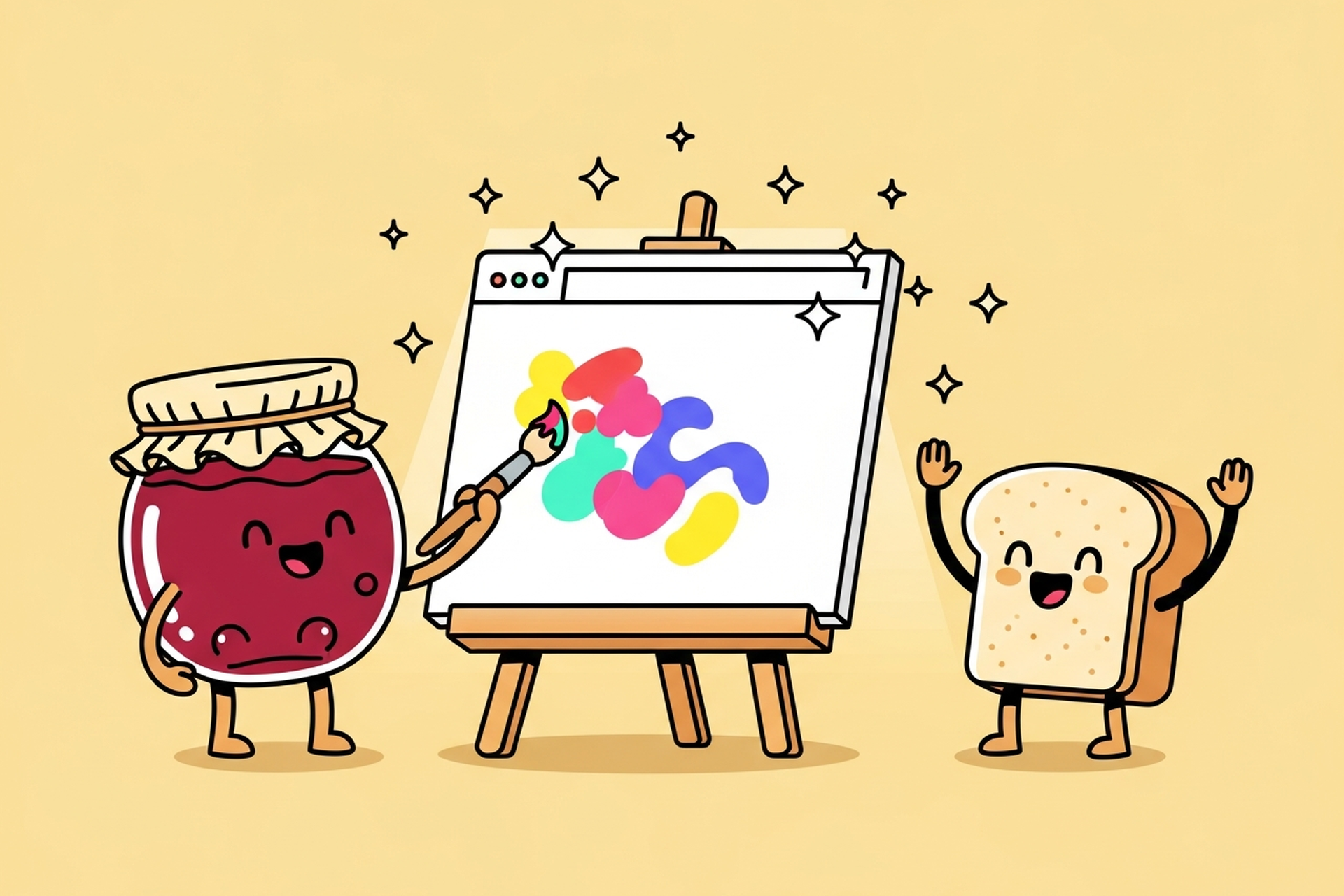
Character-based illustration signals warmth and personality. A recognizable mascot or recurring character creates an emotional connection that abstract shapes can't. It's the highest-investment illustration approach but also the highest-recognition one: a distinctive character becomes part of the brand in a way that a color palette alone can't achieve.
Hand-drawn or textured styles signal authenticity and craft. In 2026, with AI-generated imagery flooding the visual web, hand-drawn illustration has become a stronger signal than it was even two years ago. It communicates that a real person made this, which matters more as audiences become more attuned to the difference.
Isometric and 3D illustration signals technical sophistication. These styles are common in developer tools, infrastructure products, and fintech. They work well for abstract technical concepts that need to be visualized with precision.
Choosing a style that's out of step with your brand positioning creates the kind of subtle dissonance that visitors can't always name but definitely feel. The warm, playful character system on an enterprise security platform and the stiff corporate illustration on a consumer journaling app both feel wrong, even if the individual illustrations are well-executed.


"Custom illustration improves engagement" is widely repeated, but it's worth knowing how to measure whether it's true for your specific site and audience.
The most direct signal is time on page. Pages with distinctive custom illustration — particularly hero sections and feature breakdowns — tend to show higher average session duration than pages using photography or stock art. This is partly because illustration invites exploration in a way that photography doesn't: there are details to notice, character expressions to read, scenarios to interpret.
Scroll depth is a second useful signal. A well-designed hero illustration that creates curiosity draws visitors further down the page. The benchmark is whether visitors reach the fold below the hero at a higher rate than on comparable pages without illustration.
Heatmap data often shows visitors spending time on illustration areas even when those areas contain no interactive elements. That dwell time has a cost: it briefly delays attention to your CTA. The best-performing designs account for this by placing the CTA in a position that's visible alongside the illustration, not underneath it.
For social and content marketing, shareability is the clearest engagement metric. Custom illustration with a distinctive style gets saved, reposted, and cited at higher rates than photography. This is partly because it looks intentional, and partly because it's identifiable: your audience learns to recognize your illustration style, which creates brand attribution when the image is shared without context.
Hire a team of top level professionals for less money than hiring a single designer. Stupid simple design subscription service to level-up your business!
Looking forward to potentially working with ya ✌️

