Branding
May 21, 2026
Your email newsletter lands in an inbox next to dozens of others. Every single one is fighting for the same two seconds of attention. And most of them look identical: a header image that's either a stock photo of a laptop, a photo of someone looking thoughtful, or a generic abstract graphic.
Then there's the one with email newsletter illustration that's recognizably, distinctly theirs. The subscriber knows whose email it is before they read the subject line. They open it because it looks like something worth reading.
That's the ROI case for custom illustration in email, and it's not subtle. Let's get into the mechanics.
The average email open rate across industries sits around 40% when measured by sophisticated platforms — but engagement within the email (clicks, scroll depth, forwards) varies enormously based on how the email actually feels to read.
Stock imagery in email has a specific problem: your subscribers have already seen it. Not the exact image, necessarily, but the category. The flat-lay coffee cup and notebook. The team meeting in a glass-walled conference room. The person confidently looking at the camera. These images have been so thoroughly used across so much marketing content that reader brains have developed something like stock-image blindness — the same mechanism that makes people skip banner ads.
When an image looks like "marketing content," readers unconsciously de-prioritize it. They don't think "that's a stock photo, I'll skip this." They just feel less engaged, less like this content was made for them.
Custom email newsletter illustration disrupts this. A distinctive visual style — one that's specific to your brand and appears consistently in every send — trains subscribers to recognize your emails visually before they've read a word. The illustration becomes part of your brand's personality in the inbox.
Here's the dynamic most brands miss: custom illustration in email gets more valuable over time, not less.
The first time a subscriber sees your custom illustration style, it's novel and interesting. By the fifth send, it's familiar — they've started to associate that visual language with your brand. By the twentieth send, the illustration is doing active recognition work. Seeing it in the inbox preview triggers the same mental response as seeing a brand logo.
This is the compounding brand equity that stock can never build, because stock images have no continuity. Every stock image is different. There's no visual language to recognize, no style to associate with your brand.
Research in visual cognition supports this: color alone can boost reader attention span and recall by up to 82%. But the retention effect amplifies significantly when imagery is consistent and branded rather than generic. The brain stores consistent visual patterns differently than it stores novel but unrelated images.
The practical implication: each email you send with custom illustration is building an asset. Each email you send with stock imagery isn't building anything.
Not all custom illustration for email performs equally. Here's what distinguishes the effective from the merely attractive:
Email is read on phones, often in low-attention contexts. Your illustration has about 200 milliseconds to communicate something — mood, topic, brand personality — before the reader decides whether to keep reading. Illustrations that are visually complex or require reading to understand don't work as email headers. The most effective email illustration communicates at a glance: here's what this is about, here's how it feels to read.
A custom illustration that doesn't feel like your brand is just expensive stock. The illustration style should reinforce the same personality signals as your copy voice, your color palette, and your typography. If your brand is warm and conversational, your illustrations should feel warm and conversational. If your brand is precise and authoritative, the illustration style should reflect that.
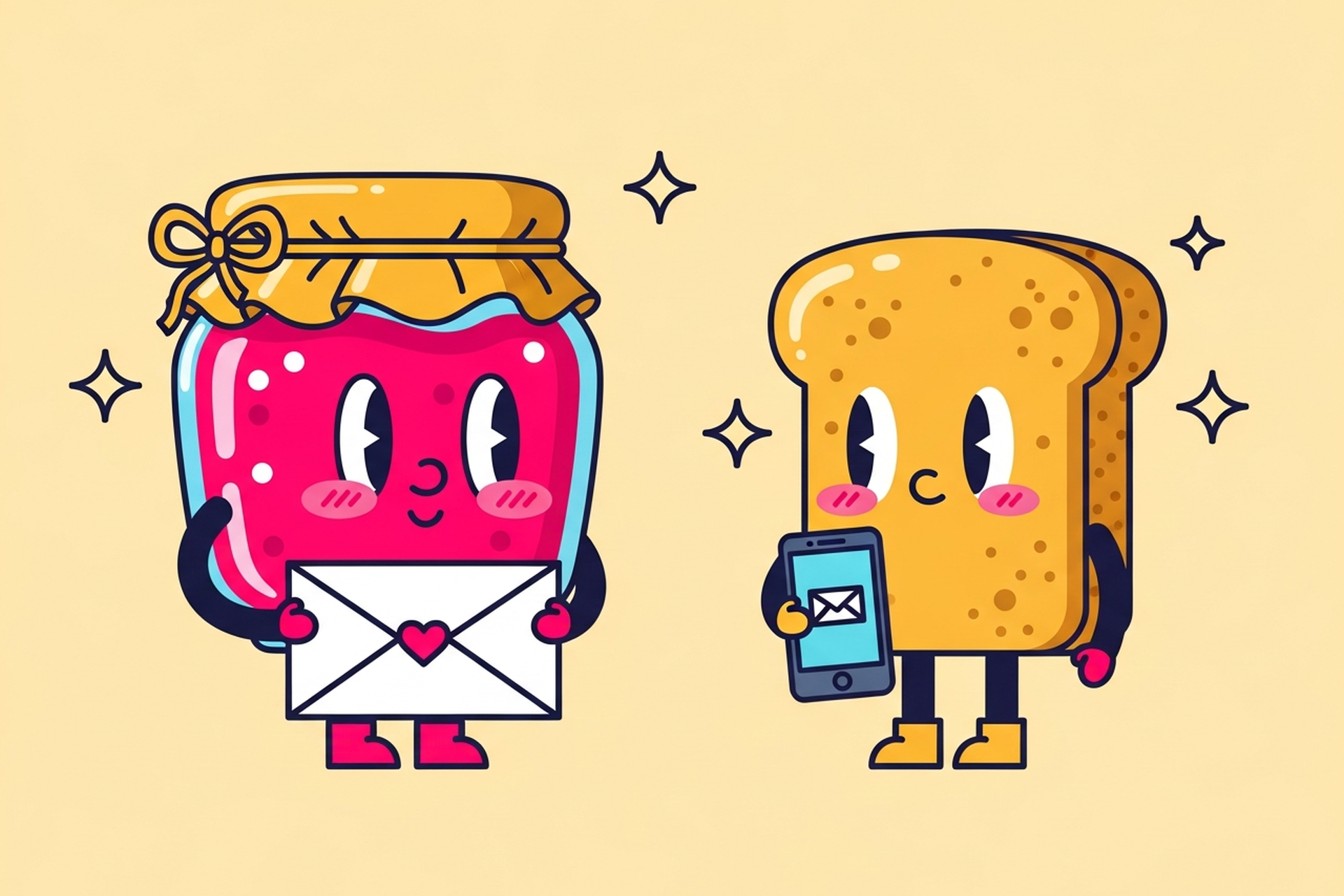
The illustrations that create the strongest subscriber recognition usually feature consistent characters or visual elements that appear across multiple sends. A recurring character — even a simple one — becomes a recognizable representative of your brand in the inbox. Subscribers start to look for them.
This doesn't require a full mascot program. Even consistent stylistic elements (a specific color treatment, a recurring visual motif, a characteristic way of rendering figures) create the continuity that builds recognition.
The brief for email illustration is different from the brief for a website hero or a social post. Email has specific constraints and objectives that should shape every design decision.
Define your send cadence and volume first. Are you sending weekly? Biweekly? Monthly? The answer determines how many illustrations you actually need and whether you need a new custom piece for each send or a more modular illustration system where elements can be recombined. Brands sending twice a week can't commission a fully custom illustration for every send — they need a visual system that generates enough variation to feel fresh while maintaining brand consistency.
Establish the visual system, not just the first piece. The most efficient brief for email illustration doesn't start with "we need an illustration for our next send." It starts with "we need an illustration style and a library of assets that can support our email program for the next six months." This produces a more consistent result and is usually more cost-effective than commissioning individual pieces without a unifying system.
Brief the emotional tone, not just the content. "We need an illustration for our June newsletter about summer productivity tips" is a content brief. "We need an illustration that feels energetic and optimistic — summer themes, a sense of movement and momentum, consistent with our warm and friendly brand voice" is a design brief. The second produces better work.
Plan for evergreen vs. topical. Some illustrations should be timeless enough to reuse across multiple sends (a general "reading/thinking" character for editorial content, a general "celebration" visual for milestones). Others are topical and get used once. A good illustration brief clarifies which type you're commissioning.
Want help thinking through your email illustration system? Book a call — we can map out what you need before your designer starts.
Custom email newsletter illustration doesn't have to mean a new original piece every single send. In fact, trying to commission fully original art for every email is usually the wrong approach.
A well-built email illustration system includes:
With this kind of system in place, each new "illustration" for a send often involves remixing existing elements rather than starting from scratch. The subscriber sees something familiar (the character, the color palette, the style) combined with something new (the specific scene or context). Familiar + novel is the formula for habitual open behavior.
Building this library takes upfront investment, but it pays dividends across every send going forward. And because each new illustration you commission adds to the library rather than existing in isolation, the system gets more valuable over time.
Not all newsletter emails need the same illustration approach. Here's how to think about the brief for different formats:
Editorial newsletters: Focus on mood and atmosphere. The illustration should prime the reader for the reading experience — curious, informed, thoughtful. Characters engaged with reading, thinking, or exploring work well.
Product update emails: Focus on clarity. The illustration should either show the new feature conceptually or reinforce the "something new" feeling of an announcement. Avoid complexity that competes with the actual content.
Promotional emails: Focus on energy and desire. These need to convert, which means the illustration should create positive emotion associated with the product or offer — not just decorate the header.
Transactional emails: Often overlooked, but high-volume sends like onboarding sequences, receipts, and milestone emails are a major opportunity. A consistent illustration style across transactional emails turns routine sends into brand-building touchpoints.
For deeper principles on commissioning visual work that serves specific communication goals, take a look at digital illustration services — the same briefing framework applies across formats.
The traditional objection to custom email illustration is cost. If you're sending weekly and commissioning custom art for every send, a project-based approach gets expensive fast.
A design subscription like Jamm changes the math. Unlimited requests, one flat monthly rate, senior designers who learn your brand, and about two business days turnaround per piece. You build your illustration system over the first few months, then use ongoing requests to extend the library, produce topical pieces for seasonal campaigns, and refresh elements as your brand evolves.
The other thing a subscription solves: the briefing friction. When you're working with a team that already knows your style, describing a new email illustration takes minutes. They know your characters, your palette, your voice. You describe the scene; they make it — which is the only way custom illustration in email delivers on its potential.
Stock imagery in email is adequate. It fills a space. It doesn't fail in any obvious way.
But "doesn't fail" isn't the goal. The goal is subscribers who recognize your email before they open it, who associate your visual language with your brand, and who open because the email feels like it was made for them — not assembled from a library.
Custom email newsletter illustration builds that. Not all at once — but consistently, over time, with compounding returns. The brands with the most loyal subscriber bases almost always have the most distinctive visual identities in the inbox.
Ready to make your emails visually unmistakable? Start your design subscription and get your first email illustration in about two business days.
Hire a team of top level professionals for less money than hiring a single designer. Stupid simple design subscription service to level-up your business!
Looking forward to potentially working with ya ✌️

