Branding
May 21, 2026
You've done everything right: the landing page converts, the trial signup is frictionless, the pricing is competitive. And then 80% of trial users never come back after their first session.
Onboarding is where most SaaS conversion actually breaks. Not the marketing. Not the pricing. The first experience inside the product.
Here's where it goes wrong — and how to fix it.
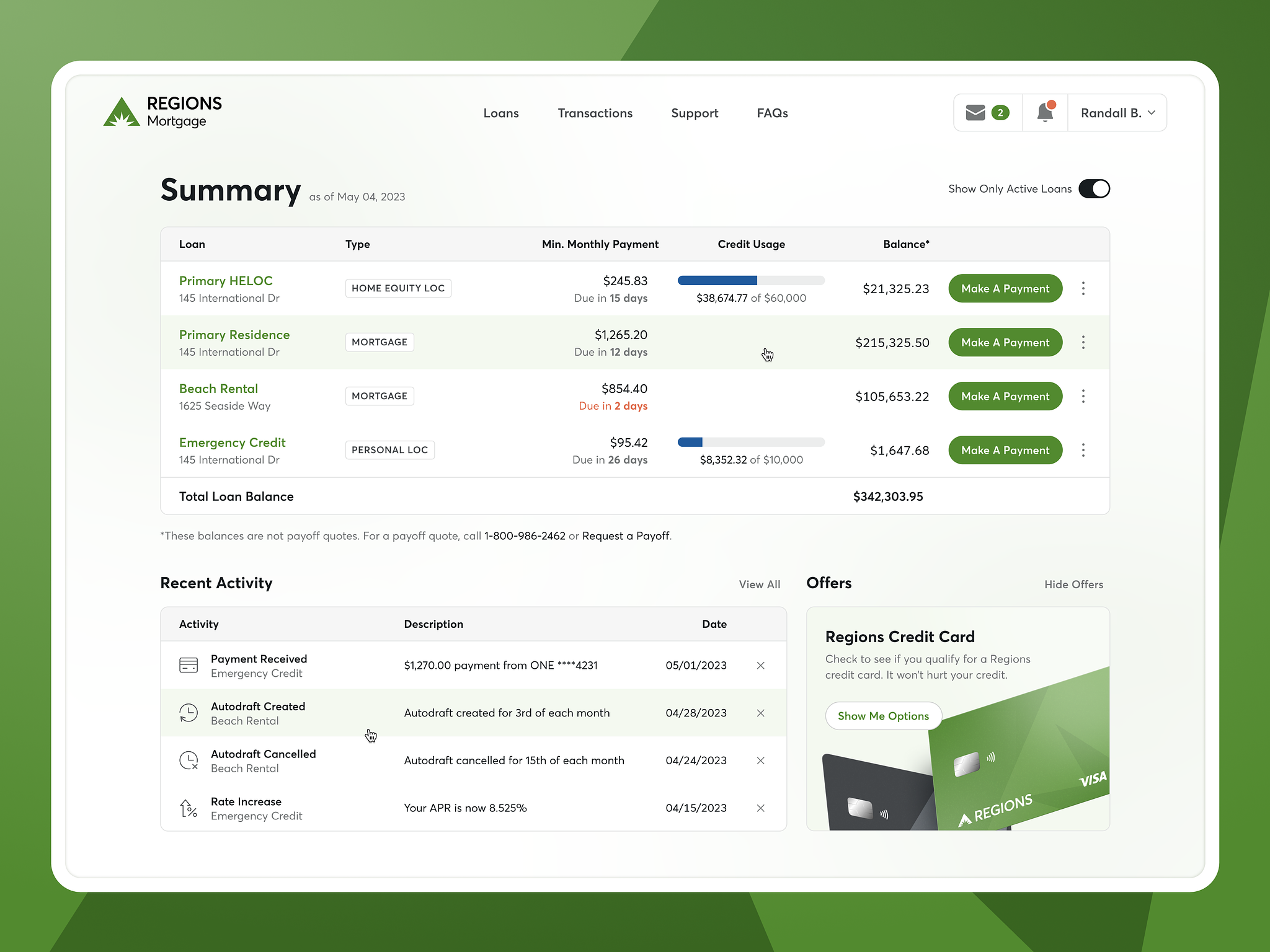
The most common onboarding failure is also the simplest: users complete signup and arrive at an empty screen with no guidance.
An empty dashboard looks like a blank canvas to you (as the builder). To a new user, it looks like they're supposed to know what to do and don't. The response is confusion, which quickly becomes doubt about whether the product is right for them, which becomes a closed tab.
The fix isn't a tooltip tour. Tooltip tours are dismissed in seconds because users want to do things, not read instructions. The fix is a clear, singular first action presented immediately: "Start by doing X." One thing. Not a menu, not a checklist of five setup tasks, not a welcome modal with three buttons. For products with complex workflows, motion graphics can communicate value without words — a short animated sequence often orients users faster than any written instructions.
The highest-converting onboarding flows in 2026 have users create something real within the first 60 seconds. Not read about features — create something. An Asana task, a Notion page, a Canva template. The product teaches itself through use, not instruction.
Founders want users to see everything the product can do. The instinct is understandable: you've built a lot of great things, and if users only know about the core feature, they might cancel when a competitor catches up on that one thing.
The reality: users who are shown too many features in their first session are more likely to churn, not less. Cognitive overload generates friction, and friction at the start of a trial is fatal. Users don't think "there's so much here to explore." They think "I don't know how to use this" and leave.
The design pattern that works: progressive disclosure. Show the minimum necessary to deliver the first moment of value. Introduce additional features contextually as users advance — when they've used the first thing and would naturally benefit from the next.
Intercom's onboarding is a studied example of this. New users see a simplified interface on first login. Features that become relevant later (automation, reporting, integrations) appear in context when the user reaches that workflow stage.
A project management tool used by a solo freelancer looks different from the same tool used by a 20-person engineering team. If your onboarding flow is identical for both, you're delivering a bad experience to at least one of them — probably both.
Segmented onboarding asks a few questions at signup (role, team size, use case, goal) and routes users to a different first experience based on their answers. This isn't just personalization theater. It changes the use cases highlighted, the templates offered, and sometimes the features surfaced in the UI.
Companies that implement segmented onboarding consistently see higher activation rates because users reach their specific "aha moment" faster. A solo freelancer whose first task creation looks like a simple personal productivity tool is more likely to stick around than one who gets the enterprise project hierarchy view immediately.
Every SaaS product has a moment where users get it — where the value clicks and they understand why they should keep using this. The question is whether your onboarding design is actively steering users toward that moment or leaving it to chance.
What this looks like in practice:
Dropbox figured this out early: users who added at least one file to a folder and synced it retained significantly better than users who didn't. So the entire onboarding flow steered new users to upload a file. Simple. Everything else could wait.
A 12-field signup form before users see the product creates drop-off before onboarding even starts. The rule is simple: collect the minimum information required to create an account and deliver value. Everything else can be asked later, in context, when users understand why you're asking.
"Profile completion" flows — where you ask for company size, job title, team count, industry, and use case before showing the product — have high abandonment rates. Even if the data would be useful for your segmentation and sales motion, the friction cost usually outweighs the completion rate.
Progressive profiling works better: start with the minimum (email, password), get users into the product, then request additional information at natural moments (when they invite a teammate, when they first set up an integration, when they upgrade).
A well-designed onboarding flow has these properties:
If your trial conversion is weak and your product works, onboarding is the most likely culprit. The patterns that drive SaaS conversion at the marketing level don't apply inside the product — users in trial have made a conditional bet on your product and are looking for reasons to commit or bail.
Great onboarding design is what tips that balance toward commit.
If you already have an onboarding flow and suspect it's underperforming, an audit is faster than a full redesign and tells you exactly where to focus first.
Map the current flow step by step. Write out every screen, decision point, and prompt in your current onboarding sequence. Most teams discover their onboarding has more steps than they remembered. Every step that doesn't directly advance the user toward the first value moment is a candidate for removal.
Identify drop-off points in your analytics. Track completion at each step and look for where the steepest drop occurs. The step with the highest abandonment rate is your priority. Don't start redesigning from the beginning when the problem is clearly in the middle.
Run a think-aloud session with five new users. Ask people who have never used your product to sign up while narrating what they're thinking and what they're trying to do. Watch where they hesitate, where they click in the wrong place, and where they give up. You'll learn more in two hours of watching real users than in three weeks of analyzing product analytics. The combination of both is more powerful than either alone.
Check your time-to-value metric. If you don't have a clear definition of your product's "aha moment" and a measurement of how long it takes new users to reach it, that's the first thing to fix before redesigning anything. Onboarding improvement without a defined value moment produces onboarding that feels smoother but doesn't actually improve retention.
Across high-converting SaaS onboarding flows, a few patterns appear consistently.
The "no empty states" principle: new users should never see a completely empty product. Sample data, template options, or a clear first-action prompt should fill any space that would otherwise look blank. Blank screens read as broken to first-time users. Fill them with intent.
The "one ask at a time" principle: each step of onboarding should ask for one thing or communicate one thing. Multi-part steps with multiple decisions increase abandonment. A signup flow that asks for email, password, company name, team size, role, and use case all on one screen is doing the equivalent of greeting a new user with a questionnaire. Break it up. Collect what you need minimum at each step.
The "reflect the goal" principle: onboarding copy should reflect the specific goal the user signed up for, not a generic welcome message. If users can tell you what they came to do (via a signup survey question), every subsequent screen should feel like it's serving that specific goal. Generic onboarding that could apply to any user doesn't build the "this product gets me" feeling that drives activation.
Improvement without measurement is just change. Set up tracking for these metrics before you redesign anything, so you have a clear before and after comparison.
Completion rate: percentage of new users who complete the defined onboarding flow. Benchmarks vary by industry and complexity, but anything below 50% on a simple flow is worth investigating.
Time to first key action: how long between signup and the first action that correlates with retention in your product. Shorter is better, but "shorter" is relative to your product. A complex B2B tool that requires configuration has a different benchmark than a simple consumer app.
7-day and 30-day retention by onboarding variant: if you're testing onboarding changes, retention at 7 and 30 days is the metric that actually matters. Trial conversion rates can be improved by making onboarding so easy that unqualified users convert too. Retention tells you whether the users who convert actually found value.
Track these metrics by cohort, not as aggregate averages. Aggregate averages hide improvement in specific user segments. A change that significantly improves retention for solo users but slightly reduces it for team users looks flat in aggregate, but the directional signal is there if you look at the cohorts.
Jamm designs product UIs and onboarding flows for SaaS teams as part of a design subscription. See our product work or book a call if your onboarding needs a second look.
Hire a team of top level professionals for less money than hiring a single designer. Stupid simple design subscription service to level-up your business!
Looking forward to potentially working with ya ✌️

