Branding
May 21, 2026
"We need illustrations" is a brief that could mean a hundred different things. Digital illustration covers an enormous range of styles, use cases, and production approaches, and the right choice depends on what you're using it for, who it's for, and what you want it to communicate about your brand.
Digital illustration services aren't interchangeable. A flat cartoon character system behaves differently from a hand-drawn editorial illustration, which behaves differently from a detailed technical diagram. This guide walks through the main styles, their best applications, and what to think about before commissioning.
Clean, geometric shapes, minimal shading, consistent stroke weights, limited color palette. Think app icons, onboarding flows, and the visual language of most SaaS products.
Best for: Product UI, onboarding sequences, explainer graphics, icon sets, website sections that need to communicate clearly at multiple sizes.
Why brands choose it: Highly scalable, easy to maintain consistency, versatile across digital and print contexts.
2026 note: The completely flat, gradient-free vector style has become somewhat generic. Brands differentiating through illustration are adding personality: hand-drawn line weights, slightly imperfect shapes, or custom character systems that go beyond the generic SaaS illustration aesthetic.
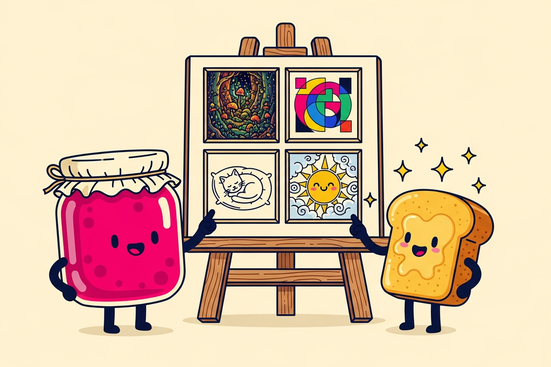
Custom mascots, recurring characters, or consistent character types that carry a brand's personality across multiple touchpoints. Jamm's own jam jar and toast characters are a good example.
Best for: Brand identity, marketing materials, email campaigns, social media, content marketing, and any context where recurring visual personality adds brand recognition.
Why brands choose it: Characters create emotional connection and are the most recognizable form of visual identity after the logo itself. A strong mascot system is infinitely reusable.
What to commission: A character system rather than individual pieces. The system defines the character's design (proportions, line weight, color), the range of expressions, a set of base poses, and the rules for creating new poses and scenarios consistently.
Styles that deliberately retain the evidence of a human hand: visible pencil lines, brush strokes, watercolor washes, imperfect shapes. In 2026, this category is growing as a reaction against the homogenized look of AI-generated content.
Best for: Editorial content, thought leadership articles, brand identity for companies that want to signal authenticity and craft, premium products and services.
Why brands choose it: Distinctiveness. In a visual environment saturated with AI-generated and generic stock imagery, hand-drawn illustration is increasingly the signal that says "a real person made this."
Diagrams, process flows, explainer graphics, and conceptual visualizations that prioritize clarity over aesthetics. Not "pretty" in the traditional sense, but highly functional.
Best for: Product documentation, onboarding explainers, marketing content that needs to explain complex concepts, pitch decks that illustrate market dynamics or business models.
Why brands choose it: Stock imagery can't show your specific product, process, or concept. Custom technical illustration can show exactly what you mean.
Three-dimensional rendered objects and characters with depth, light, and shadow. Computationally intensive to produce but visually distinctive.
Best for: Hero sections for tech products, product packaging, premium brand presentations.
Why brands choose it: The depth and realism signal a higher production investment. Effective for brands where a premium, forward-looking aesthetic is part of the positioning.
The right illustration style for your brand isn't primarily an aesthetic decision. It's a strategic one. Ask:
What does the style communicate about us? Flat vector signals clarity and functionality. Hand-drawn signals craft and authenticity. Character-based signals personality and accessibility. 3D signals technical sophistication and premium quality.
If you're building a complete visual language — not just individual pieces but a repeatable system of characters, scenes, and graphic elements — how to build a brand illustration style covers the full process from style exploration to a documented system.
Where will it live? An illustration system that needs to work at icon size, on a mobile screen, in a print brochure, and on a website banner has different requirements than one that only appears at large scale on a homepage hero.
How will it be extended over time? If you need ongoing illustration content (new scenarios, new characters, new use cases), choose a style that can be produced efficiently at scale. Highly detailed hand-drawn work is harder to extend quickly than a well-defined flat vector system.
What do competitors use? Look at three to five direct competitors. If they all use the same flat vector style (most SaaS companies do), a hand-drawn or character-based style immediately differentiates you in the category.
Once you've chosen a direction, a good brief covers:
Jamm's illustration team covers character design, flat vector systems, hand-drawn illustration, and technical diagrams as part of a flat-rate subscription. Book a call to discuss your illustration needs.
First-time buyers of digital illustration services often underestimate how much the process shapes the result. Understanding what typically happens — and where decisions get made — helps you get better output.
Most professional illustration projects start with a discovery phase: the illustrator asks about your brand, your audience, the context for the illustrations, and your visual references. The quality of your answers here directly determines the quality of the first concept. Vague input produces concepts that require heavy revision; specific input produces concepts that are close to right on the first pass.
After discovery, most illustrators provide a style exploration or mood board — two or three visual directions that interpret your brief differently. This is the most important decision point in the whole project. Choosing the right direction here means the rest of the project flows smoothly. Choosing the wrong one, or delaying this decision, is where projects go over budget and timeline.
Once a style direction is locked, the illustrator produces tight sketches or wireframe compositions before moving to final art. Review sketches, not finished illustrations. Changes at the sketch stage cost minutes. Changes at the finished art stage cost hours.
The final phase is delivery of production-ready files. For digital illustration, this means SVG for web use, layered files for future editing, and PNGs at the sizes you'll actually use. Make sure you receive all of these before considering the project complete.
Not all illustration services are structured the same way. Before committing to a studio or freelancer, these questions help clarify whether the arrangement fits your needs:
Do you work with an established style guide or define one from scratch? If you have existing brand guidelines, ask how they'll be integrated. If you're starting fresh, ask what the style definition process looks like and how many concept directions you'll see.
What's included in revision rounds? This is the most common source of billing surprises. "One revision" can mean one consolidated list of changes, or it can mean one change per element. Get this defined in writing before the project starts.
Who owns the final files? You should own the finished illustrations outright, including the source files. Some studios retain source files and provide only flattened exports, which creates dependency for future changes. Ask specifically whether you receive layered, editable source files as part of the deliverable.
What's the process for extending the system later? If you need more illustrations in six months, can you request them without starting the whole process over? Well-structured illustration systems come with a style guide that makes future extensions consistent, whether you work with the same illustrator or bring someone new in.
Hire a team of top level professionals for less money than hiring a single designer. Stupid simple design subscription service to level-up your business!
Looking forward to potentially working with ya ✌️

