Branding
May 21, 2026
You've seen it happen. A brand launches with a tight, distinctive illustration style. Everything from the website hero to the onboarding emails to the social posts uses the same visual language. The characters, the color palette, the line weights — it all feels coherent. And then six months later, the marketing team is three designers in, every asset looks slightly different, and the "illustration style" is now just "whatever the current contractor does."
Building a brand illustration style that's actually yours — that stays yours as your team grows — requires more than commissioning a few nice illustrations. It requires building a system.
This guide covers how to define that system: how to choose a style direction, how to document it so anyone can work within it, and how to make sure your visual language scales with your brand.
Illustrations are part of your brand identity in the same way your logo and typography are. When done consistently, a distinctive brand illustration style builds recognition over time. Audiences start to associate a visual language with your brand before they see your logo — because the style precedes the identifier.
This is how the best-known brands use illustration. Dropbox has a clean, humanity-forward illustration style with limited color and clear compositions. Mailchimp has a quirky, warm, hand-crafted feel that communicates personality. Slack uses illustration to explain complex workflows with visual clarity. Each of these styles is immediately recognizable, and that recognition doesn't happen by accident — it's the result of a deliberate system, consistently applied.
Research from brand design supports this: consistent visual identity across touchpoints increases brand recognition by up to 80%. Illustration is often the most expressive part of that identity — it communicates personality in a way that typography and color alone can't.
The brands that lose this advantage are the ones that treat illustration as decoration rather than system. Each piece gets commissioned separately, with slightly different styles, and the cumulative effect is visual noise instead of a coherent identity.
Before you can document a style, you need to define it. This is the hardest part, and the part most brands rush.
There are genuinely different approaches that work for different brands. The question isn't which style is better — it's which style fits your brand personality, your audience, and your use contexts.
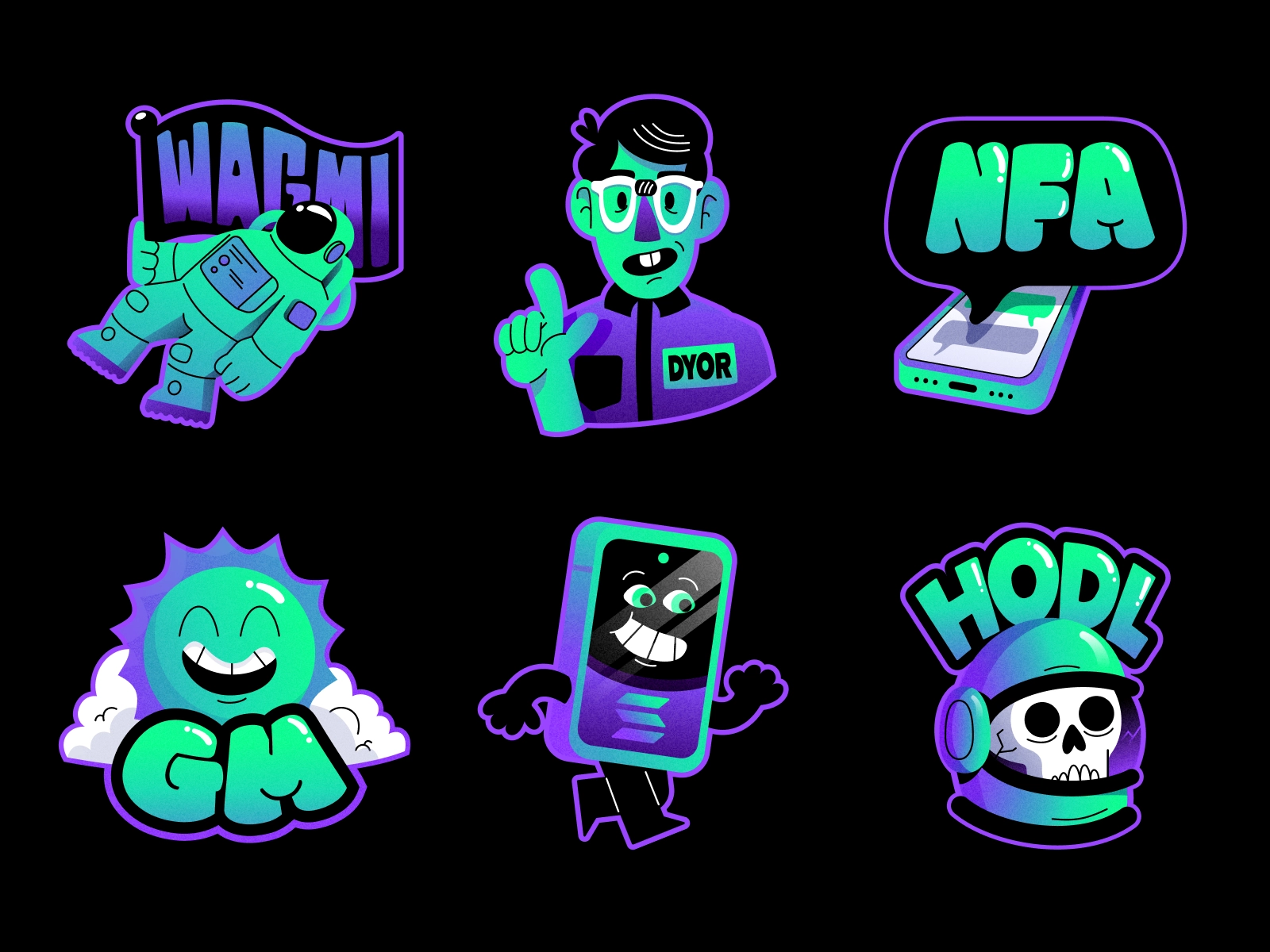
Clean shapes, limited color palettes, no gradients or drop shadows. This style communicates clarity, modernity, and confidence. It works especially well for tech and SaaS brands that need to communicate complex ideas simply. It's also very scalable — flat illustration is easier to produce consistently because the rules are clear and the style is less dependent on individual stylistic quirks.
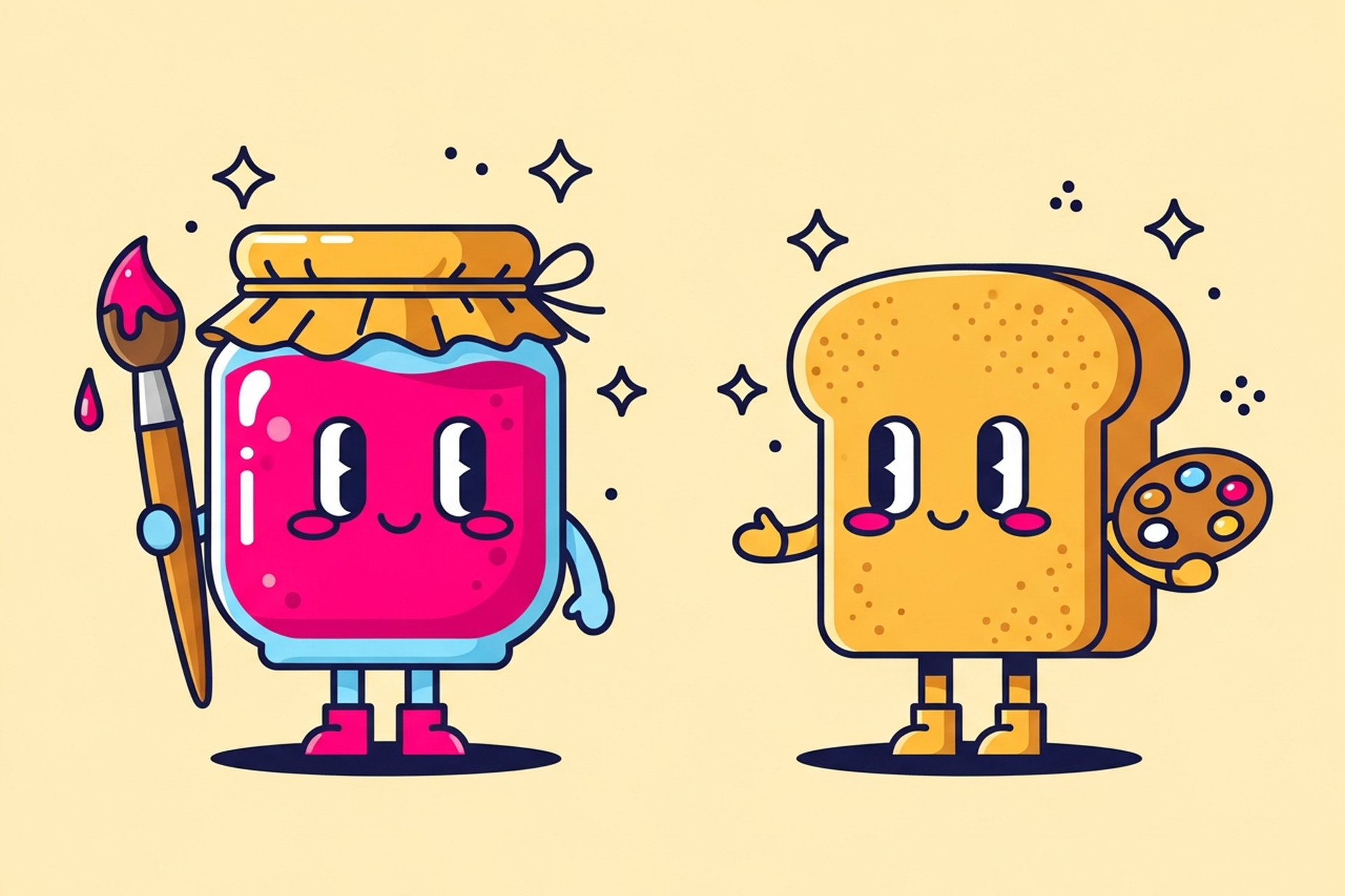
Expressive characters with distinct personalities, warmer color palettes, more organic shapes. This style communicates approachability, humanity, and fun. It works well for consumer brands, community-oriented products, and any brand that wants to feel less corporate. The challenge is that character consistency is harder to maintain — characters require more careful style documentation and are more sensitive to individual illustrator interpretation.
3D-inspired depth without realistic rendering. This style is popular for product and infrastructure visualization — it communicates system complexity in an organized, readable way. It's particularly effective for illustrating products, platforms, and technical workflows where flat illustration feels too abstract.
Texture, line variation, imperfection-as-style. This communicates craft, authenticity, and warmth. It's having a significant moment in branding right now — especially among brands targeting audiences who are skeptical of the polished, generic SaaS aesthetic. The challenge is that hand-drawn styles are the hardest to produce consistently and require illustrators with specific skills.
The decision shouldn't be "what do we like" — it should be "what communicates our brand personality to our specific audience, consistently, across all the contexts we need it for."
A few questions that sharpen the decision:
Once you've defined a direction, the work is documentation. A brand illustration style isn't real until it's written down in a way that lets other designers work within it.
Here's what a complete illustration style guide includes:
Color palette for illustration. This isn't necessarily the same as your brand color palette, though it should be related. Define the specific colors used in illustrations, including any gradients (or the rule that there are no gradients), and how illustration colors interact with background colors and photography.
Line weight and stroke rules. Do your illustrations use outlines? What weight? Consistent across all sizes, or does weight adapt to size? Outline color — is it always the same color, or does it adapt to the illustration context? These seem like small decisions, but inconsistency here is immediately visible.
Shape language. Are your characters and objects made of rounded shapes or angular ones? Is there a consistent level of geometric simplification? Shape language communicates personality: rounded communicates warmth and approachability, angular communicates precision and confidence.
Character design system. If your style includes characters (human figures, mascots, animals), you need a character system: face construction rules, body proportions, expression range, skin tone palette, and how characters interact with objects and each other. This is the most detailed section of an illustration guide and the most critical for consistency.
Composition principles. How are elements arranged? Is there a consistent use of whitespace? Do your illustrations always have a ground line, or do figures float? Composition consistency is what makes a set of illustrations feel like a set rather than a collection of individual pieces.
What's not allowed. The negative space of a style guide is as important as the positive specifications. Document the things your illustration style explicitly avoids — certain types of shadows, certain color combinations, certain levels of detail — so future designers know where the boundaries are.

The biggest myth about brand illustration style is that it's a one-time project. Commission a style guide and an initial set of illustrations, and you're done.
You're not done. You're starting.
A visual language grows with your brand. New product features need new illustrations. New campaigns need new visual interpretations of the brand. The style guide gets tested and refined as you discover what works in production and what doesn't.
This is why the "big project" approach to brand illustration has real limitations. Spending a large budget on an initial style definition and illustration set, then going months before the next commission, produces a brand visual language that stagnates. Your marketing starts to feel like it's using the same five illustrations in rotation because it literally is.
The alternative is treating illustration as an ongoing production capability rather than a project. A subscription design model gives you access to senior illustrators who work within your established style, deliver new pieces regularly, and refine the system as they go. Turnaround on individual pieces runs about two business days — fast enough to keep up with a real content calendar.
Want to see how this works in practice? Book a call and we can walk through how Jamm builds and maintains illustration systems for growing brands.
Defining style by reference rather than rules. "We want something like Notion's illustration style" is a starting point, not a brief. The output of style exploration should be documented rules, not just approved samples. Without rules, you can't consistently reproduce the style.
Forgetting the contexts. An illustration style that looks great on a white background might completely fall apart on a dark background or at small sizes in a mobile UI. Test your style direction across actual use contexts before committing.
Over-specifying before exploring. Some brands write a ten-page illustration brief before seeing a single sketch. The best illustration style development involves exploration — multiple directions presented quickly, then a single direction developed into a full system. Designing the process to allow for early exploration produces better results than over-specifying at the start.
Not testing with different illustrators. A style that only one specific person can produce isn't a style — it's a personal interpretation. Real style documentation should allow multiple illustrators to work within the system and produce consistent results. If it can't, the documentation needs more work.
For more on building a strong brief that gives illustrators what they need, how to brief an illustrator covers the mechanics in detail.
Building a brand illustration style is a long-term investment in brand equity. The brands with the most distinctive and recognizable visual languages — the ones where you see a single illustration and immediately know whose brand it is — built those visual languages through consistent application over time, not a single big design sprint.
Start with clear style definition. Document it rigorously. Commission new illustrations regularly, not only when you're launching something big. Refine the style guide as you learn what works. And work with designers who understand that illustration style is a system to be maintained, not a project to be delivered.
Ready to build a brand illustration style that's actually yours? Start your design subscription — senior designers, unlimited requests, about two business days per delivery, cancel anytime.
Hire a team of top level professionals for less money than hiring a single designer. Stupid simple design subscription service to level-up your business!
Looking forward to potentially working with ya ✌️

