Branding
May 21, 2026
Investors don't fund brands. They fund businesses. But your brand signals things about your business before you say anything: how clearly you understand your market, how disciplined your execution is, whether you've thought through your positioning or just shipped something functional and moved on.
Here's what tech startup branding investors actually notice, and what they're inferring from what they see.
When an investor reviews your website, pitch deck, or product for the first time, they're not evaluating whether your logo is clever. They're asking a faster, more important question: does this team know what they're doing?
A coherent, consistent brand signals yes. Not because aesthetics imply business judgment, but because brand coherence is the output of positioning clarity. If your website communicates a sharp, specific value proposition to a clearly defined audience, that's evidence that you understand your market. If your brand is generic or inconsistent, it suggests the underlying thinking hasn't been done.
The signal investors actually read from brand: clarity of thought about positioning and audience.
Website, before the pitch. Most investors have looked at your website before the first meeting. In many cases, the website is what determined whether there was a first meeting. The homepage hero section (that first viewport) needs to communicate who you're for, what you do, and why it matters within seconds. A generic hero with clever-but-ambiguous copy fails this test.
Pitch deck design quality. The average investor reviews a pitch deck in under four minutes. A poorly designed deck with inconsistent fonts and misaligned graphics signals careless execution, which investors extrapolate to execution quality more broadly. A well-designed deck doesn't guarantee funding, but a sloppy one creates doubt that's hard to recover from in a short window.
Product UI, if the product is live. For software companies, the product interface is brand expression in the most visible form. A product that looks pre-launch (inconsistent spacing, amateur typography, mismatched component styles) signals that the team hasn't sweated details. For enterprise or B2B SaaS especially, where customers are trusting you with business-critical workflows, UI quality is a proxy for trust.
Consistency across everything. Investors notice when your deck looks different from your website, which looks different from your product, which looks different from your LinkedIn. Inconsistency signals either a team that hasn't invested in brand coherence or one that has gone through multiple pivots without cleaning up the trail.
Market clarity. If your brand communicates specifically to a defined audience with a specific value proposition, it implies you've done the customer discovery work to know that audience. Vague branding implies vague market understanding.
Execution discipline. The quality of your visual materials is a concrete, visible piece of evidence for how your team executes. If your pitch deck is polished and consistent, investors give you the benefit of the doubt on product and operations quality. If it's rough, they wonder what else is rough.
Category intent. Companies building a new category need their brand to communicate the category framing. If you're trying to position yourself as the enterprise standard for a specific workflow, your brand needs to look like an enterprise company, not a startup side project.
Team sophistication. Investors are betting on people. A well-considered brand signals that someone on the team (or in the team's network) has the taste and judgment to make good design decisions. That matters increasingly as the company scales and needs to make product, marketing, and hiring decisions that require consistent judgment.
Creative cleverness. Clever logos, visual puns, and design awards don't move investors. Clarity moves investors. A logo that clearly communicates your category and looks competent beats an award-winning concept that confuses people.
Color choices beyond basic professionalism. Whether you use blue or green or orange doesn't matter. What matters is whether the palette is applied consistently and looks intentional rather than accidental.
Trendy design aesthetics. Glassmorphism, bento grid layouts, or whatever visual trend is current doesn't register with most investors. They're not designers. What registers is whether the work looks professional and whether the core message comes through.
These are the patterns that consistently create negative impressions before the pitch even starts:
"We're for everyone" positioning. Homepages that describe a platform for "businesses of all sizes" or "any team" signal undefined market focus. Investors who specialize in a sector know who the serious players in that space are, what they look like, and how they communicate. Generic positioning reads as undifferentiated.
Inconsistency between marketing site and product. If your website looks funded and the product looks like a hackathon project, investors notice the gap. The inference is that the team can execute marketing but not product, or that the product is further behind than the deck implies.
A sloppy pitch deck from a company claiming high execution standards. A SaaS company pitching on "superior UX" with a misaligned, inconsistent deck is sending a contradictory signal. The claim and the evidence don't match.
Generic stock photography. Websites full of stock photos of diverse teams at whiteboards signal that the company hasn't invested in brand differentiation. Custom illustration, product screenshots, and real team photography all send stronger signals than licensed stock.
The investors who notice brand aren't reacting to aesthetics. They're responding to the clarity and consistency that good brand work forces on a company.
A homepage that communicates one specific value proposition to one specific audience, with a visual hierarchy that makes the primary message impossible to miss.
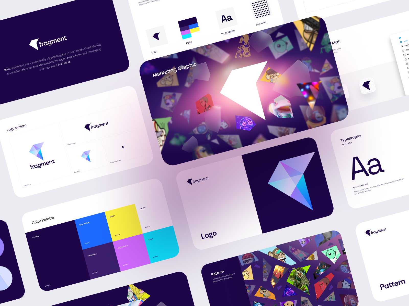
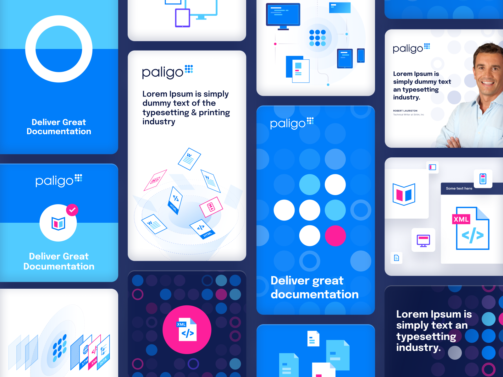
The same typography, color application, and visual style across the website, pitch deck, and any other materials an investor might encounter before or after the meeting.
For software companies, the product UI is a brand signal. Investors reviewing a B2B SaaS product are making inferences about whether enterprise buyers would trust it with business-critical workflows. Polished, consistent UI reduces that doubt.
Three things that build investor confidence before you're in the room:
Jamm builds brand systems that hold up under investor scrutiny: visual identity, pitch deck design, and product UI. See our work or book a call to talk through your specific situation.
Hire a team of top level professionals for less money than hiring a single designer. Stupid simple design subscription service to level-up your business!
Looking forward to potentially working with ya ✌️

