Branding
May 21, 2026

The median SaaS landing page converts at 3.8%. The best ones hit 15% or higher. That's a 4x gap driven almost entirely by design and structure decisions, not budget or traffic quality.
SaaS landing page design has its own set of patterns that work differently from ecommerce, lead gen, or informational pages. SaaS visitors need to understand a product, believe it works, trust the company selling it, and feel like the price is worth it. The page has to do all of that in under 60 seconds of attention.
Here are the patterns that separate top-performing SaaS pages from average ones.
The best-converting SaaS landing pages share a recognizable structure. It's not a rigid template, but the sequence of persuasion follows a consistent logic:
The logic is: capture attention, establish credibility, create need, demonstrate value, remove doubt, ask for action. When any step is skipped, conversion drops.
The above-the-fold experience is everything. Most visitors don't scroll, so if the hero doesn't earn continued attention, nothing else matters.
What high-converting SaaS heroes have:
A benefit-led headline that names an outcome, not a feature. "Ship your website in hours, not weeks" beats "The all-in-one web design platform." Tell people what changes for them, not what your product does.
A specific sub-headline that adds one layer of detail: who it's for, how it works at a high level, or what sets it apart.
One clear CTA, not two or three. Multiple CTAs divide attention and lower click-through on all of them.
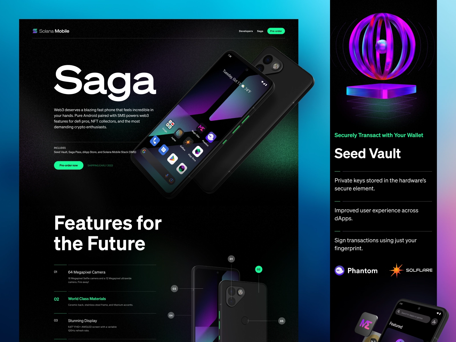
Visual product evidence. Screenshots, a short video demo, or an interactive preview communicate more about what the product actually does than any headline can. SaaS pages that show real UI in the hero convert significantly better than those showing abstract illustrations or metaphorical imagery.
SaaS visitors are skeptical. They've been burned by overpromising tools before. Social proof is how you short-circuit that skepticism, but only if it's placed where visitors actually see it.
Logo bars above the fold are one of the highest-ROI design decisions on a SaaS landing page. Recognizable customer logos signal "real companies use this" before the visitor has invested any time reading.
Specific outcome testimonials convert better than generic praise. "We cut our onboarding time by 40% in the first month" is more persuasive than "Love this tool, 5 stars." Name, title, company, and a photo all increase credibility.
Quantified results (number of users, data processed, uptime percentage) add a layer of third-party credibility that copy alone can't match.
SaaS design in 2026 has moved away from the generic SaaS aesthetic (gradient blobs, abstract hero illustrations, pastel cards) toward more personality and product specificity.
Bento-style grids are widely used for feature sections, breaking content into modular card units that are visually scannable and mobile-friendly.
Interactive product previews embedded in the page (clickable demos, guided tours) are replacing static screenshots for products that need explanation. Visitors who interact with a product preview before clicking CTA convert at meaningfully higher rates.
Typography as visual identity. Type treatment has gotten bolder, with more contrast and personality in heading choices. The era of generic Inter + light gray SaaS design is receding.
CTA copy should describe the outcome, not the action. "Start your free trial" is generic. "See your first site live today" is specific. "Get a free demo" underspecifies what the prospect is actually getting.
High-converting SaaS pages:
Features-first structure. Features are about you. Benefits are about the visitor. Most SaaS pages lead with what the product does rather than what changes for the buyer. Flip the order.
Too much navigation. Landing pages should remove navigation that invites visitors to leave. Keep exits minimal.
Social proof in the wrong place. Testimonials buried three scrolls down get ignored. Front-load your best proof.
No specificity. "Powerful," "flexible," "all-in-one" are category noise. Specifics (actual metrics, named customers, specific workflows) create real differentiation.
Mobile afterthought. More than half of SaaS landing page traffic is mobile. Design for that context first, not last.
If your SaaS landing pages need a redesign or you're iterating on conversion performance, Jamm handles SaaS design as ongoing subscription work. Brief a landing page, get it designed and built in Webflow, and iterate based on your test results without paying per-project rates. Book a call to talk through your funnel.
The patterns described above aren't abstract. Here's what they look like when applied to actual SaaS design work.
Bento-grid feature layouts break a product's capabilities into scannable, visual units. Each cell in the grid focuses on one outcome: what the feature does and why it matters. This approach is more effective than long-form feature lists because it respects how SaaS visitors actually read pages: scanning for the thing that's relevant to them, not reading every word in order.
The best bento layouts pair each feature with a small product screenshot or illustration that communicates the outcome visually. "Instant collaboration" means more with a screenshot showing two cursors on a doc than with just the text.
Showing the actual product UI in the hero is now the standard for high-performing SaaS pages, not just a nice-to-have. This works because it reduces the mental work required to understand what you're selling. A visitor who can see the product before they've read a word is already evaluating it.
This doesn't require a polished product demo video. A clean screenshot of the core product view, cropped and contextualized in the hero, does the job. The key is that it shows the product in a real use context, not an abstract illustration that could represent any SaaS tool.
A brief that gets you a high-performing SaaS page in the fewest feedback rounds covers these elements:
The specific conversion goal. Free trial signup, demo request, pricing page click, email capture: name exactly one. A page optimized for multiple conversion goals converts poorly for all of them.
The audience's primary objection. What's the thing standing between your ideal customer and clicking the CTA? Price? Complexity? Switching cost? Implementation time? The page needs to address this directly, and the designer can only do that if you name it.
The product's primary differentiator. In one sentence: why does someone choose your product over the alternatives? Not a list of features. The one thing.
Existing proof. Customer quotes with outcomes, company logos, usage metrics, case study results. Hand these over in the brief so the designer builds them into the structure from the start, not as an afterthought.
Traffic source. A page receiving paid search traffic from a specific keyword query should be designed differently from a page linked from a newsletter. The visitor context shapes the hierarchy and copy angle. Include this in the brief.
Hire a team of top level professionals for less money than hiring a single designer. Stupid simple design subscription service to level-up your business!
Looking forward to potentially working with ya ✌️

