Branding
May 21, 2026

SaaS design has a defined job: move visitors to trials, trials to activation, activation to retention. Every design pattern either supports or undermines that funnel. The patterns that work aren't secrets. They're observable in every high-performing SaaS product and consistently absent in mediocre ones.
Here's what the patterns look like across the three most design-sensitive parts of a SaaS design system: the marketing site, onboarding, and the product itself.
Top-performing SaaS sites lead with the problem, not the product. "Stop losing leads in your inbox" converts better than "The leading CRM for sales teams." The first identifies a pain the visitor recognizes. The second makes the visitor do the work of figuring out whether they have the problem you solve.
The structure that works: problem headline, solution mechanism in the sub-headline, evidence in the hero body copy, CTA that asks for a low-commitment first step.
Visitors can't evaluate a product they can't see. The top conversion factor for SaaS hero sections is showing actual product UI, not an abstract visualization of what the product does.
In 2026, this has evolved beyond static screenshots. Interactive product previews, embedded demos, and animated UI walkthroughs in the hero section are now standard for top-performing SaaS marketing sites. Visitors who interact with a product preview before converting have significantly higher trial-to-paid conversion rates.
Most SaaS sites place testimonials in a dedicated section mid-page. Top performers put social proof signals immediately after the hero (logo bars, review ratings) and adjacent to every primary CTA. Social proof converts best when it's visible at the moment of decision.
Onboarding is the highest-leverage UX investment in SaaS. Guided, interactive onboarding increases trial-to-paid conversion by up to 400-500% compared to passive onboarding. The pattern is consistent:
Get to value fast. The time-to-value is the single most predictive metric for SaaS activation. Every step between signup and first "aha moment" is potential drop-off. Strip onboarding to the minimum needed to reach that first value moment, then collect the rest.
Show progress. Progress indicators in onboarding flows (step 2 of 5, a simple progress bar) increase completion rates. Users who see progress are more likely to finish. Users who feel lost abandon.
Celebrate micro-wins. When users complete a meaningful action (connected their first integration, created their first project, invited a first team member), acknowledge it. Positive reinforcement during onboarding creates habit formation.
Contextualize features at the moment of need. Feature tooltips and contextual guidance that appear when a user reaches the relevant part of the product outperform front-loaded feature tours that show everything before the user has context for why any of it matters.
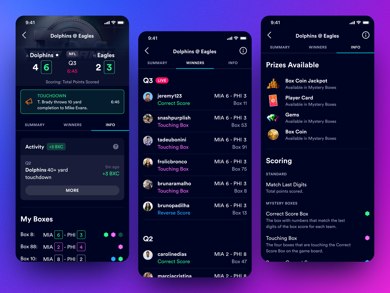
Empty states are the experience when a user has no data, no history, no content. Most products treat them as non-design territory. Top products treat them as conversion moments.
Good empty states: explain what the space is for, show what it will look like when populated, and provide a clear path to populate it. Bad empty states: show nothing, a generic placeholder, or an error-like message that creates uncertainty.
Show users what they need for their current task. Hide advanced features behind secondary navigation, settings panels, or progressive reveal patterns. A product that shows everything at once overwhelms. A product that reveals complexity as users are ready to engage it feels easier to use as you get more experienced.
In product UI, visual hierarchy isn't just aesthetics. It's the communication of what matters most on each screen. Primary actions should be visually primary. Secondary actions should be secondary. Destructive actions should require confirmation and should not look like primary actions.
When visual hierarchy breaks (everything is the same size and weight, multiple things compete for primary attention), users make more errors and feel less confident.
The in-between moments (while data loads, while an action processes, while a navigation transition happens) are design opportunities most products ignore. Well-designed loading states maintain user orientation and trust. Missing or jarring transition states create uncertainty.
The patterns above aren't new information. Most SaaS teams have read some version of them. The gap between knowing the patterns and executing them well comes down to a few consistent mistakes.
Designing for the current user, not the new user. Your team has been in the product for months. You know where everything is, what the terminology means, and how to accomplish any task. New users don't have that context. Features that feel obvious to insiders create friction for anyone encountering them fresh. Design decisions made by people who know the product tend to favor power users over the newcomers who will determine whether you grow.
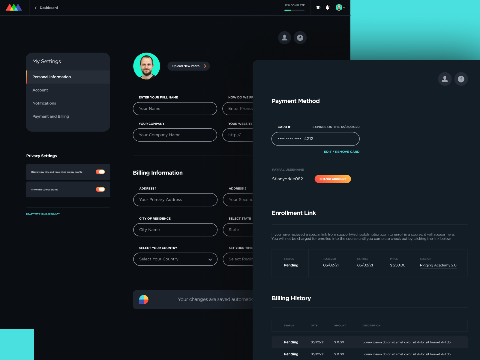
Shipping UI without system thinking. Individual screen designs that don't connect to a component library create technical debt that compounds. Every time someone redesigns a button here or a card there without updating the system, consistency degrades. Inconsistency in a product UI costs trust in a way that's hard to measure and easy to underestimate.
Treating onboarding as a separate problem from the product. The handoff from marketing site to product shouldn't feel like a reset. Users who arrive expecting one experience and get something that feels disconnected are more likely to disengage. The visual language, the tone, the interactions: they should all carry across.
When you're ready to address design issues, the brief you give matters as much as who you hire.
Start with the behavior you're trying to change. Not "make the dashboard feel less cluttered" but "users are abandoning the setup flow at step 4, and we need to figure out why and fix it." The first is an aesthetic preference. The second is a problem with a measurable outcome.
Include context about who the user is. Role, experience level, and what they were trying to accomplish when they hit the friction point. A brief that gives a designer a clear picture of the user is a brief that produces focused solutions rather than general improvements.
Define success before design starts. What does "better" look like? A completion rate, a time-on-task metric, a reduction in support requests about this flow? Design work without a clear success metric has no natural stopping point.
Not every design problem needs a complete overhaul. The decision between targeted iteration and a broader redesign depends on the scope of the underlying issue.
Iteration works when: the structure of the product is sound, users understand the basic flow, and specific friction points are identifiable and isolated. Fix the empty state, simplify the step that's creating drop-off, improve the component that's creating confusion.
A broader redesign makes sense when: the information architecture is fundamentally wrong, the visual system is too inconsistent to maintain, or the product is growing into use cases it wasn't designed for. In these situations, patching individual problems doesn't address the root cause.
For teams building or iterating on SaaS products, Jamm covers product UI and UX work as part of a flat-rate subscription. Senior designers who understand SaaS-specific patterns, sequential requests, ~2 business day turnaround. Book a call to talk through your product.
Hire a team of top level professionals for less money than hiring a single designer. Stupid simple design subscription service to level-up your business!
Looking forward to potentially working with ya ✌️

