Branding
May 21, 2026

There's a version of this question that gets asked all the time: "Should we add animation to our landing page?"
And the honest answer is: it depends what kind.
Motion design on landing pages is one of those areas where the execution gap between good and bad is enormous. The right animation can meaningfully lift conversion. The wrong animation can hurt it — and hurt it badly. So the question isn't really "animation yes or no?" It's "which animations, where, and why?"
Let's look at what the research actually says, then get practical about how to apply it.
Motion design for landing pages has a clear positive track record when it's used with intention. Here are some concrete numbers worth knowing.
Interactive product demos convert at 12.3% versus 4.7% for static hero images on B2B landing pages — a meaningful gap that reflects how much better motion communicates product value than a screenshot can.
Scroll-driven reveal animations showing product benefits can drive 22% higher CTA clicks than static equivalent pages. Skeleton loaders and smooth image transitions reduce bounce rate by about 9%.
Animated CTAs — buttons with a subtle pulse or attention-directing motion — improve click-through rates by up to 30% in A/B tests.
What do these results have in common? They all describe animation that supports the conversion decision. Motion that makes the product clearer, makes the CTA more visible, or makes the page feel faster and more responsive. None of them describe animation for decoration.
When page elements animate into view as the user scrolls — a product screenshot sliding in, a list item appearing with a subtle fade, a headline building one line at a time — the page feels alive and intentional. More importantly, it creates micro-moments of visual novelty that keep the user reading.
The key mechanic: reveal animations make each section feel like new information arriving, rather than a static page that was always there. That pacing effect mirrors the experience of having something explained to you, which maps naturally onto the way a landing page should communicate.
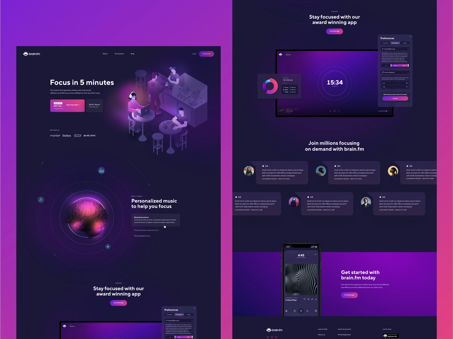
A hero section that shows your product in motion — a demo loop, a feature walkthrough, a before/after transition — communicates value in a way that copy and screenshots simply can't. Visitors understand what they're signing up for. The perceived risk of the signup drops.
This is where the 12.3% vs 4.7% gap lives. Interactive or animated product demos outperform static heroes because they build confidence before the click.
The execution constraint: the animation must be lightweight. A hero animation that takes 3 seconds to load is worse than a static image. SVG animations, MP4 loops optimized for web, and CSS-based micro-interactions all load fast. Heavy video files don't.
When a button responds to hover with a subtle animation. When a form field highlights on focus. When a successful submission triggers a visual confirmation. These micro-interactions don't "convert" in isolation, but they contribute to a sense of product quality and polish that influences trust — and trust influences conversion.
Research on this effect finds it hard to measure directly, but designers who've A/B tested polished micro-interactions against flat static states consistently see lower bounce rates and better form completion.

Here's the other side of the research. Animation that hurts landing page conversion shares a different set of characteristics.
Background particles. Floating abstract shapes. Gradient blobs that rotate slowly. Hero sections where things move but nothing communicates. This type of animation creates visual noise without adding information or guiding attention.
The result: visitors spend cognitive resources parsing motion that doesn't help them make a decision. Attention that should go to your headline and CTA goes to the background instead.
There's also a taste signal here. Decorative animations peaked around 2019. In 2026, they read as a legacy pattern — a tell that the design is following trends rather than solving problems. If your audience is sophisticated, this works against you.
Page speed is a conversion killer. Every second of load time increases bounce rate measurably. Any animation that is file-heavy, JavaScript-dependent, or that blocks above-the-fold rendering is a conversion liability — regardless of how good it looks.
A landing page with a 400kb hero video that takes 2 seconds to appear will underperform a page with a 20kb SVG animation that appears instantly. Always. Core Web Vitals are a real factor in both search ranking and user perception of quality.
This is a known hostile UX pattern and still shows up regularly. Autoplay video is fine. Autoplay video with sound is a page bounce trigger for a significant percentage of users. If your animation involves audio, it should be opt-in — muted by default with a visible unmute control.
Users with vestibular disorders can experience motion sickness from certain types of animation — parallax scrolling, large-scale movement, content that spins or zooms rapidly. Modern browsers support the prefers-reduced-motion media query, which allows you to disable or reduce animations for users who've set this preference. Ignoring it is both an accessibility failure and, increasingly, a legal exposure.
Good motion design accounts for this from the start, not as an afterthought.
Here's a practical test for every animation on a landing page. Ask: does this motion do at least one of the following?
Direct attention to something the visitor needs to see (headline, CTA, key product feature)?
Communicate a product state or interaction that can't be shown effectively in a static image?
Reduce perceived wait time by signaling that something is loading or processing?
Build trust through polish and responsive feedback states?
If the answer to all four is no, the animation probably shouldn't be there.
This isn't a framework for making landing pages boring. It's a framework for making animation earn its place instead of just occupying space.
Need help auditing what's on your landing page right now — or building a new one with motion that actually converts? Book a call and let's look at it together.
The Jamm design subscription includes landing page design as part of the scope — which means animated components, motion design direction, and UI/UX that factors in how elements will behave on scroll and interaction.
Work happens one request at a time. You submit a brief for a landing page redesign or a specific animated section, Jamm delivers it for your review, and you give feedback before the next piece begins. No big reveals at the end of a three-week sprint. No animation decisions that get locked in before you've seen them.
If you're working with a developer who can implement motion, Jamm can provide animation specs, style guides, and motion direction as part of the design deliverable. If you're using a no-code tool like Webflow, the animated components can be designed to work natively within that environment.
This is one of those areas where the difference between "we added some animations" and "this landing page uses motion strategically" is entirely about design thinking. Senior designers who understand both conversion and craft don't come cheap — unless they're part of a flat-rate subscription.
For more context on how animated content performs in social contexts, see the animated social media performance breakdown — the principles around attention and motion quality translate directly.
Does animation convert? Yes — when it's purposeful, fast, and functional. No — when it's decorative, slow, or attention-fragmenting.
The goal of motion design on a landing page is the same as the goal of the landing page itself: to move a visitor toward a conversion decision with as little friction and as much clarity as possible. Every animation should serve that goal or step aside.
Landing pages that use motion this way consistently outperform their static equivalents. The ones that use motion carelessly often underperform them.
Start your design subscription and get landing page design that treats animation as a conversion tool — not a decoration.
Hire a team of top level professionals for less money than hiring a single designer. Stupid simple design subscription service to level-up your business!
Looking forward to potentially working with ya ✌️

