Branding
May 21, 2026

Most guides on lead generation landing pages spend 80% of their words on copywriting frameworks and A/B testing theory. That's fine. But copy sitting inside a broken layout still won't convert.
This playbook is about design. The visual decisions that make a lead generation landing page feel trustworthy, easy to read, and impossible to leave without clicking something. If you've got a solid offer and you need to know how to build a page around it, this is for you.
Before getting into tactics, it helps to be clear on the job. A lead gen page has one goal: collect contact information from someone who's interested but not yet ready to buy. That's it.
This is different from a sales page (which closes a transaction) or a product page (which covers all features for all audiences). Lead gen pages are narrower. They need to earn trust fast, reduce friction, and give the visitor a reason to hand over their email or phone number.
Everything in the design should serve that one goal.
Visual hierarchy is the order in which a person's eye moves through your page. On a well-designed lead gen page, that order should be:
If your page has those five elements stacked in a different order, or worse, crammed into a cluttered above-the-fold section, visitors won't know where to look. Confusion kills conversions before the copy even gets read.
Size, contrast, and whitespace are the tools. Big headline, medium subhead, breathing room around the form. That's the baseline.

Notice how pages with a clear focal point (typically the headline or the form) waste no time telling you what to do. There's no visual competition. The eye lands, reads, and moves to the CTA.
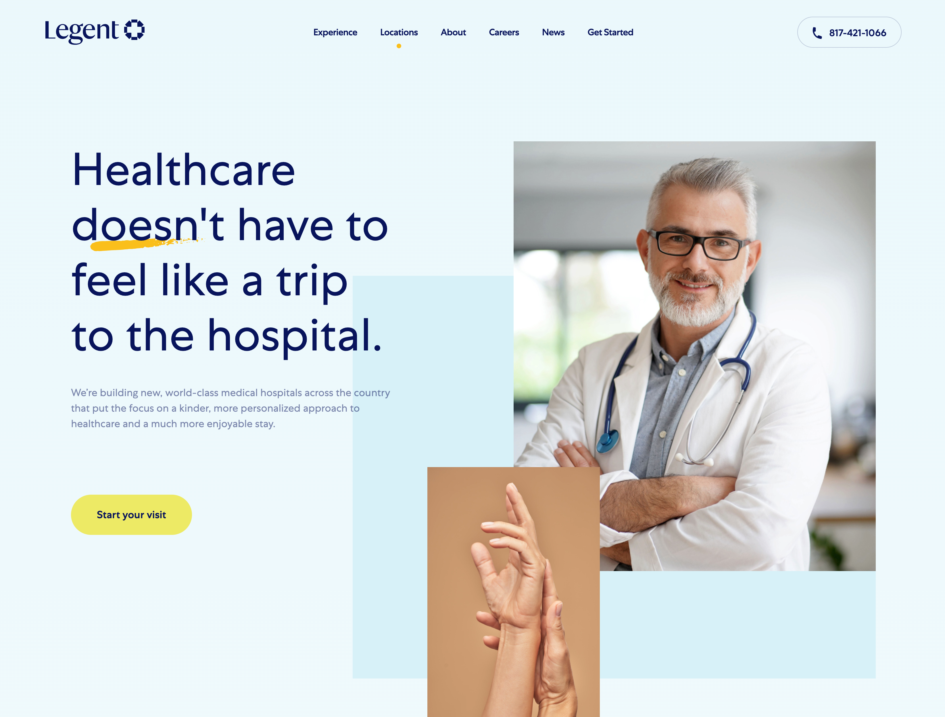
Your hero section (the part visible before anyone scrolls) carries most of the conversion weight. Research consistently shows that visitors decide within a few seconds whether to stay or go. The hero section is where that decision happens.
Three things need to be true above the fold:
The headline communicates the outcome, not the feature. "Get more leads from your website" beats "Advanced lead capture software" every time. Founders and marketing teams don't buy features. They buy results.
The visual supports the message. If you're selling a SaaS tool, show the interface. If you're selling a service, show the result or the team. Abstract illustrations can work, but they need to connect to something real. Stock photos of people smiling at laptops do not count.
The CTA is visible without scrolling. On desktop and mobile. This sounds obvious, but it's broken on more pages than you'd think.

The darker color scheme above works because contrast is doing the heavy lifting. The CTA button reads instantly against the background. Visual contrast is a design decision, and on lead gen pages it directly affects click-through rate.
The form is the conversion moment. Everything else on the page exists to get someone to fill it out. So it's worth spending real time on how it looks, not just what fields it contains.
A few design principles that matter here:
Short forms convert better, but context matters. Two fields (name + email) work well for content downloads and free trials. Four to five fields are appropriate for B2B service leads where you want qualification baked in. More than five fields should only exist if there's a clear reason, like booking a call with specific time slots.
The form should look like a form. Input fields need visible borders or backgrounds that distinguish them from the rest of the page. Floating label designs that hide the field label until someone clicks are common, but they create confusion when a user tabs between fields.
The submit button copy matters more than most people think. "Submit" is the worst option. Options like "Get my free audit," "Book a demo," or "Send me the guide" convert better because they remind the visitor what they're getting, right at the moment they're committing.
Place the form in the flow of attention. On short pages, center the form in the hero. On longer pages, consider a sticky sidebar form or a repeated CTA block mid-page and at the bottom.
Want help rethinking the design of your lead gen page? Let's connect and we'll audit what you have and rebuild it from the ground up.
Trust signals are the design elements that tell a visitor "this is real, other people use this, and you're safe handing over your information." They include:
The design mistake most teams make is treating these as afterthoughts: dumping a row of logos at the bottom of the page after the form. That's too late. By the time someone gets to the footer, they've already decided.
The better approach is to place trust signals near the form, or just below the hero section. A single strong testimonial with a real photo, a real name, and a specific result does more work than a logo grid.
The layout above shows how trust signals can be woven into the page structure rather than bolted on as an afterthought. The proximity to the CTA area isn't accidental.
Over 80% of landing page traffic now comes from mobile devices. That number alone should make mobile-first design the default, not an optimization pass at the end.
On mobile, a few things change:
The biggest mobile mistake isn't small buttons or bad fonts. It's page weight. Oversized images that load slowly on mobile networks tank both user experience and conversion rate.
Pages without oversized images average an 11.4% conversion rate. Pages with them drop to 9.8%. That gap is pure design debt.
This step is about discipline. Lead gen pages that perform well are usually the result of removing things, not adding them.
Navigation menus are the biggest offender. If your landing page has a full site nav with six dropdown menus, you've built an exit ramp. Every link that takes someone away from the page before they convert is a potential lost lead.
The standard practice for high-performing lead gen pages is to remove the nav entirely, or replace it with just a logo and the CTA button. Footer links should be minimal: privacy policy and maybe a contact link, nothing else.
The same logic applies to page sections. If a section doesn't add credibility, answer an objection, or push someone toward the form, it probably shouldn't be there. Feature lists for the sake of completeness, team bios, blog feeds: these belong somewhere else on your site, not on a focused lead gen page.
If you want to see how design decisions like these play out across different formats and page types, this breakdown of 5 key landing page elements covers the essentials in detail.
Most teams stop thinking about design the moment the form is submitted. The thank-you page is an afterthought: a generic "Thanks, we'll be in touch" message dropped onto a blank page.
That's a missed opportunity.
The thank-you page is the highest-intent moment in your entire funnel. The visitor just gave you their information. They're engaged. The design and copy on that page can:
A well-designed thank-you page keeps momentum going. A blank one kills it.
The formula for a lead generation landing page that works isn't complicated, but it requires every design decision to serve the same goal:
The difference between a page that converts at 3% and one that converts at 12% is usually not the offer. It's the design execution.
Jamm works with startups and growing teams to build landing pages and full websites that are built to convert from the first pixel. If your current lead gen page isn't pulling its weight, we'd love to look at it.
Book a call and we'll walk through what's working, what's not, and what a redesign could do for your pipeline.
Hire a team of top level professionals for less money than hiring a single designer. Stupid simple design subscription service to level-up your business!
Looking forward to potentially working with ya ✌️

