Branding
May 21, 2026
Here's a question that comes up constantly in growing startups: should we commission icon design services for a custom set, or just grab something from Heroicons, Lucide, or one of the other excellent free libraries out there?
The honest answer is: it depends, and the decision matters more than most people realize. Using a library when you should have custom icons is a branding mistake that compounds over time. Commissioning custom when a library would serve you fine is wasted budget that could go elsewhere.
This guide breaks down the actual decision — no gatekeeping, no "always go custom" bias. Just the framework for making the right call for your product and stage.
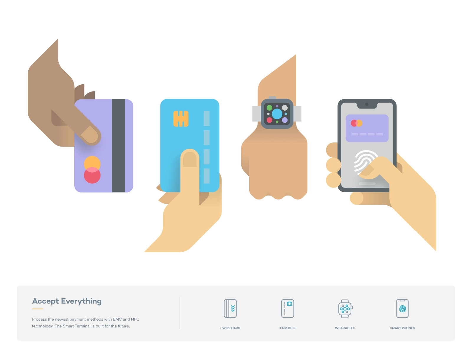
The free icon library ecosystem is genuinely excellent right now. Libraries like Heroicons, Tabler, Lucide, and Phosphor offer thousands of SVGs, designed to a consistent visual standard, maintained by active communities, and free to use. A project like Tabler alone contains over 5,000 icons in multiple styles.
For early-stage products, internal tools, or any context where the UI is a means to an end rather than a brand expression — this is the right move. Libraries are fast to implement, zero cost, and already built for consistency. If your engineering team needs something on a dashboard by Friday, a library is the answer.
The ceiling shows up when your product starts looking exactly like everyone else's. These libraries are widely used. Heroicons is so common in SaaS interfaces that its visual language reads as "generic B2B tool." That's fine until you're trying to stand out in a competitive market, or until your brand identity is strong enough that it deserves consistent expression in every UI element.
Custom icon design isn't just about aesthetics. There are specific functional and strategic triggers that make it the right investment:
You have a mature brand identity. If you've already invested in logo design, typography, color systems, and illustration style, but your product UI is running on a generic icon library — there's a visual disconnect. Your marketing site looks like one brand; your product looks like a SaaS template. Custom icons close that gap.
Your product UI is a key part of the user experience. Enterprise tools, consumer apps, and products with complex navigation all benefit from icons that are designed for their specific context. A custom icon set can encode your brand's personality — whether that's friendly and rounded or sharp and minimal — in a way that generic libraries can't.
You need icons that don't exist in any library. Custom product features, proprietary workflows, or industry-specific concepts often have no visual analog in general-purpose icon sets. If you're explaining a unique process or representing a concept that's specific to your domain, you need something made for you.
Brand differentiation is a strategic priority. Research consistently shows that distinct visual identity — including iconography — boosts user recognition and retention. Apps with custom icon systems stand out in saturated markets in a way that library icons simply can't match.
Pricing for custom icons varies significantly. Individual icon design from freelancers ranges from $50 to $1,000 per icon depending on complexity and experience level. Agency rates and senior designer rates sit at the higher end of that range.
For a full product icon set — the kind of systematic work that covers all states, sizes, and brand expressions — you're typically commissioning 30 to 100+ icons as a cohesive set rather than individual pieces. This is where working with a design team on subscription makes sense: you can commission icons in batches, refine the style guide across multiple sessions, and build out your system incrementally without committing to a large upfront project fee.
The mistake most founders make is treating icon design as a one-time project. A good icon system grows with your product. New features need new icons. Existing icons get refined as your brand matures. Locking into a fixed-scope project means going back through a procurement process every time something changes.
Want a team that handles all of this without the project overhead? Book a call to see how Jamm's subscription model works for icon systems.
Here's something that matters more than most founders expect: icon style is as important as the icons themselves.
A common mistake is commissioning a set of icons that are technically well-designed but visually inconsistent with the rest of the brand. Stroke weights, corner radii, level of detail, fill vs. outline — all of these need to be calibrated against your existing visual identity.
This is why good icon design services start with a style audit before a single icon is drawn. The designer needs to understand your typography (because icon weight should relate to your font weight), your illustration style if you have one, your color palette, and the contexts where icons will appear. An icon that works at 24px in a nav bar needs to also work at 16px in a data table and 48px in a marketing graphic.
When you commission a custom set, you should expect to receive not just the icons but also a style guide — documentation of the design rules that lets future designers add to the set without breaking consistency.
If you've decided to commission custom icons, the quality of your brief directly affects the quality of what you get. Here's what a solid brief includes:
Inventory first. Before you brief, list every icon you need. Group them by context: navigation icons, action icons, status icons, empty state illustrations. This scoping work prevents the most common mistake in icon projects — realizing mid-engagement that you need 40 more icons than you initially estimated.
Reference existing visual assets. Share your logo, your marketing site, any existing illustrations, and examples of icon styles you like and don't like. "Clean and minimal" means different things to different designers — visual references make it unambiguous.
Define your use contexts. Where will these icons appear? At what sizes? On what backgrounds? Light mode only, or dark mode too? In print? Icons designed without knowing their context get redesigned when they don't work in the real product.
Specify deliverable format. SVG source files, with clear naming conventions, exported at the sizes you need. Icon design for web and product should always include vector source — never just PNGs.
For more detail on briefing creative work, take a look at how to brief an illustrator — the same principles apply to icon design.
Here's a simple way to think about it:
Use a library if:
Commission custom icon design services if:
The hybrid approach: Many mature startups use a library as the base for standard functional icons (checkmarks, arrows, close buttons) and commission custom icons for brand-forward moments — hero sections, empty states, onboarding flows, and feature illustrations. This is usually the most efficient allocation of design budget.
Good icon design services follow a predictable process:
With a subscription design model, this process is distributed across multiple requests rather than a single fixed project. You get a sample batch, refine the direction, then add icons incrementally as your product evolves. Turnaround on each batch is typically around two business days — fast enough to keep up with product development.
The key is working with senior designers who understand both brand identity and UI design. Icon design sits at the intersection of both, and it shows when a designer only knows one side.
Icon libraries are genuinely good and the right choice for a lot of situations. Don't let anyone convince you that you need custom icons before you're ready.
But when you're ready — when your brand is defined, your product is scaling, and your UI needs to express who you are rather than just function — custom icon design services are an investment that pays off in every customer touchpoint where your product appears.
The question is always: is this the moment when the difference matters? For early-stage, usually no. For growth-stage brands with defined identities, almost always yes.
Ready to build an icon system that actually fits your brand? Start your design subscription and get your first icons in about two business days.
Hire a team of top level professionals for less money than hiring a single designer. Stupid simple design subscription service to level-up your business!
Looking forward to potentially working with ya ✌️

