Branding
May 21, 2026
Bad illustration briefs are expensive. Not just in money: in revision rounds, in misaligned expectations, in the frustration of getting work back that's technically good but completely wrong for your needs.
The most common brief failure is treating the illustrator like a mind reader. "Something fun and colorful that captures our brand essence" tells a skilled illustrator almost nothing actionable. They're making a series of judgment calls on your behalf: what's fun to them, what colors work, what "captures the brand" means visually.
Every judgment call they make without guidance is a decision you might need to reverse later. And reversals cost revision rounds.
The second failure is too much vagueness paired with too much rigidity about the wrong things. Briefs that leave the creative brief open-ended but then specify exact dimensions only, or specify a mood board without describing what specifically resonated about each reference, put the illustrator in the worst possible position: constrained where they shouldn't be, unconstrained where they should be.
One short paragraph: what's the project, who are you, and what is this illustration for? This context shapes every creative decision the illustrator makes. An illustration for an investor pitch deck communicates differently than one for a children's app, even if the visual subject is similar.
Specify exactly what you need: a single hero illustration, a set of five spot illustrations, icons for an onboarding flow. Include the number of pieces, the approximate sizes, and the final format (SVG for web, PNG for print, both).
A hero image for a dark-background website needs different thinking than an illustration for a white-background blog post. A social media graphic operates at different scales than a website banner. Context changes composition, contrast, and color choices.
Who will see this, and what do you want them to feel or understand? "Startup founders who are skeptical about design spending" shapes the tone very differently than "mid-size marketing teams exploring new tools." The more specific, the better.
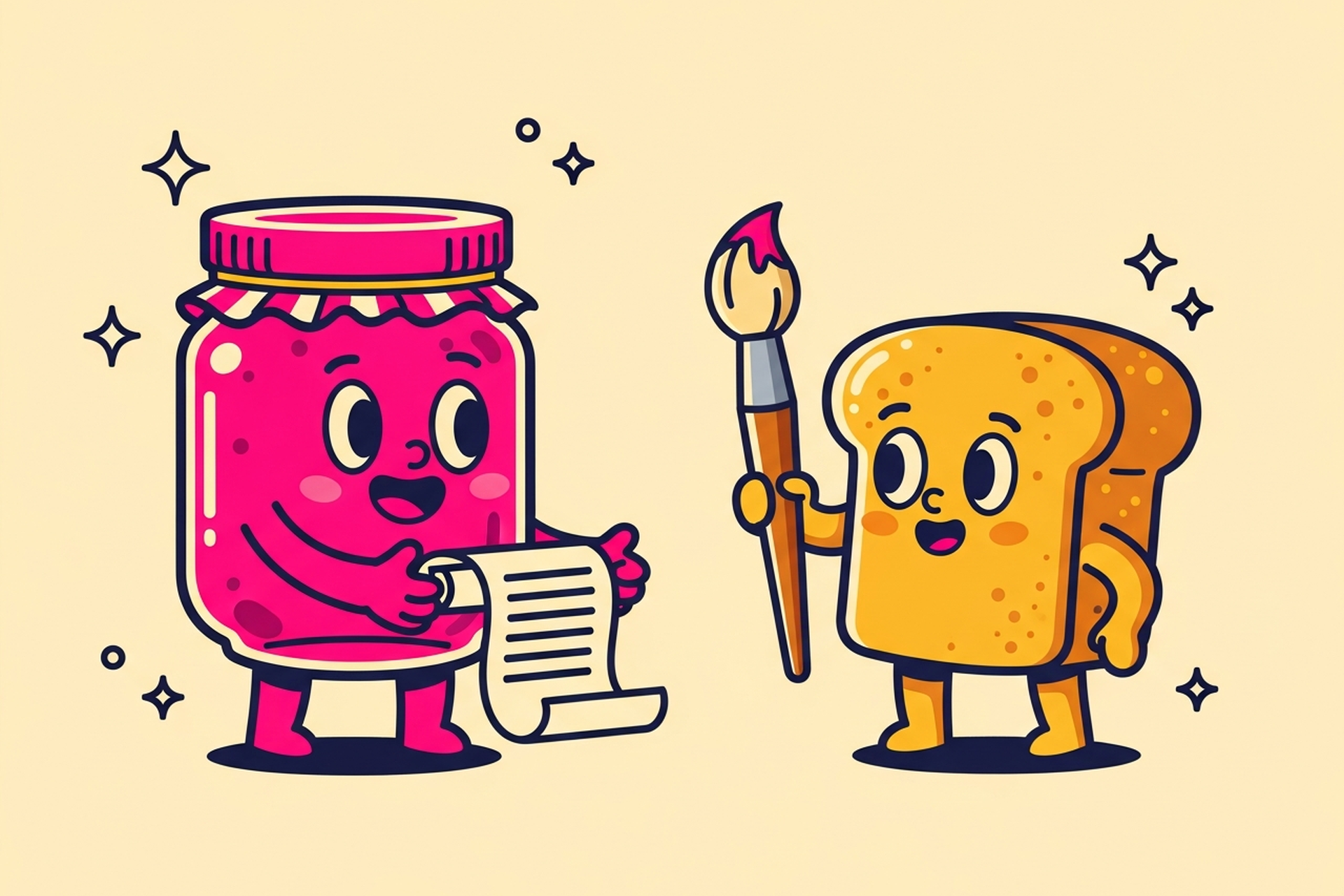
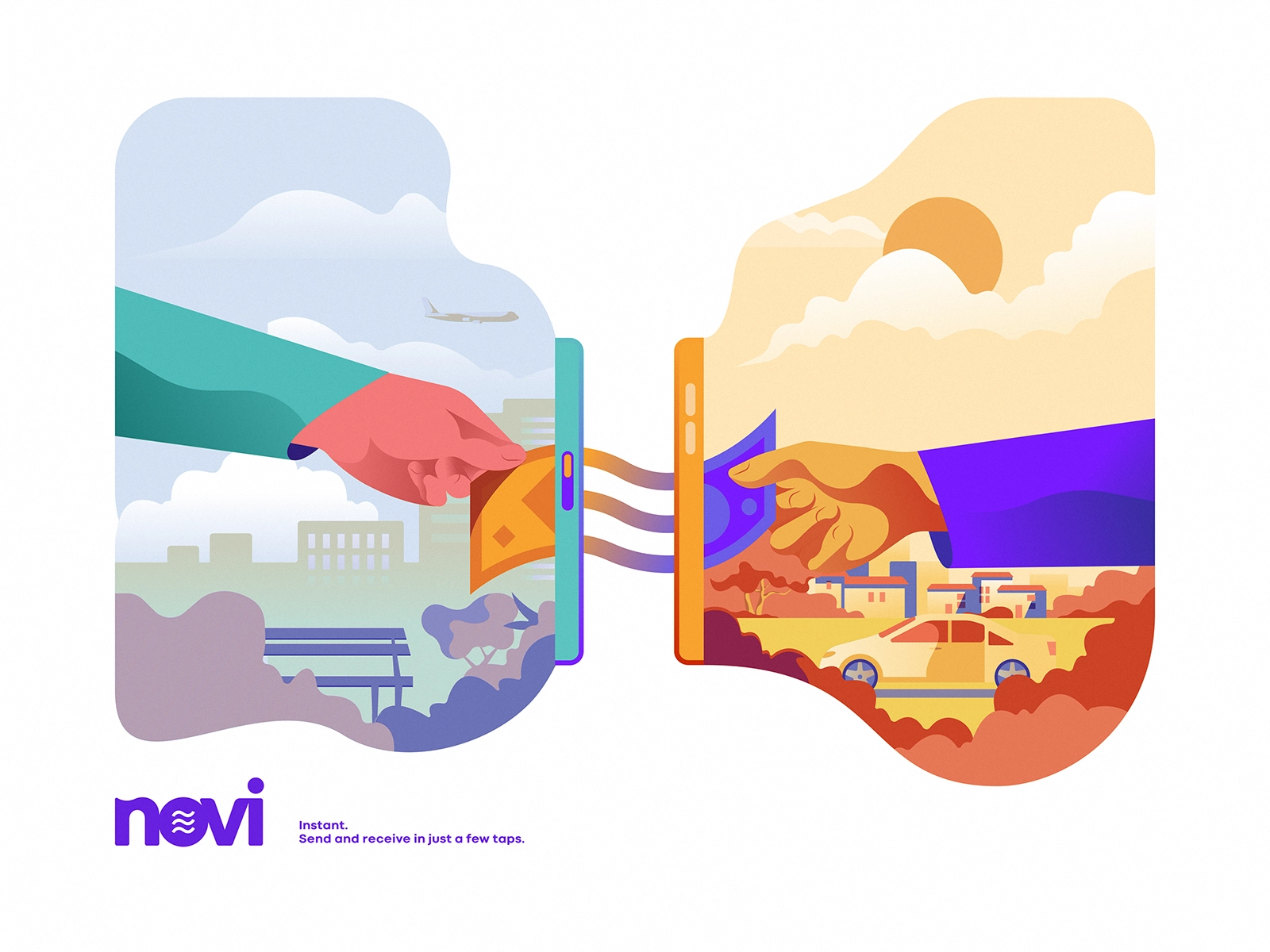
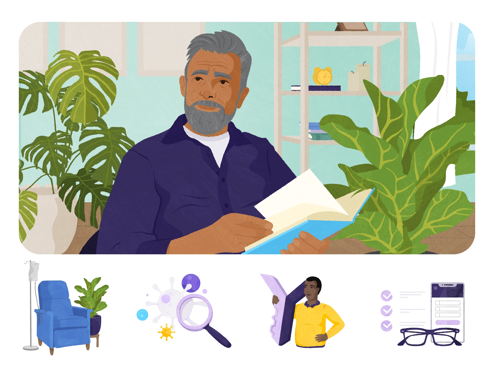
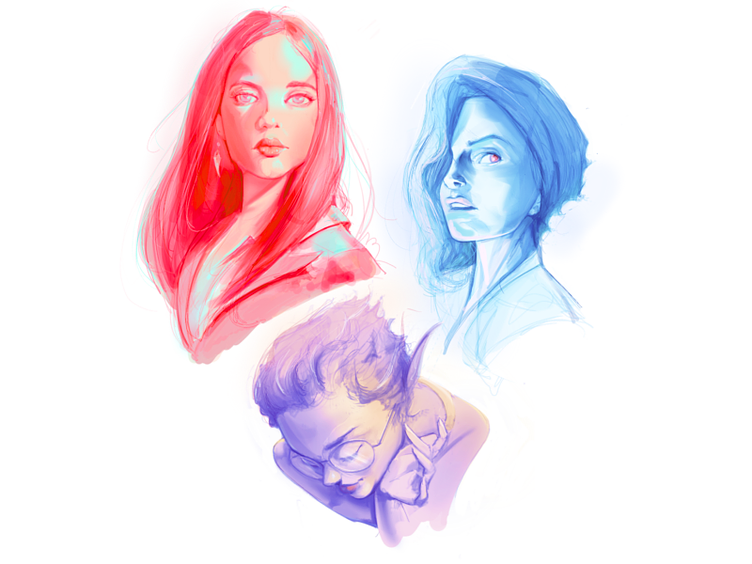
This is the highest-value part of a brief. Include specific examples from the illustrator's own portfolio that show the complexity and style you're looking for. Then add external references: "the character weight in this, the color palette in that, the loose line quality in this other one."
Explain what specifically you like about each reference. "I like this" is less useful than "I like the way these characters have simple round shapes rather than realistic proportions."
What absolutely must be in the illustration? Named characters, specific objects, a particular color that matches your brand system. List these explicitly so the illustrator isn't guessing.
Equally important: what shouldn't appear? Competitors' visual styles, certain color families that clash with your brand, overly literal interpretations of abstract concepts. "Don't use blue tones" or "avoid anything that looks corporate or stiff" are useful constraints.
How many revision rounds are included? What's the deadline for first concept? When do you need final files? Agreeing on this upfront prevents the negotiation from happening when you're already mid-project and under time pressure.
Here's the difference between a weak brief and a strong one for the same project:
Weak: "We need an illustration of our product for our homepage. Something that shows how easy it is to use. Colorful and modern."
Strong: "We need a single hero illustration (2400x1600px, SVG) for our homepage, above the fold on a cream background. It should show a relaxed person using our mobile app without showing a literal phone screen (we want to avoid the cliche). Audience is busy freelancers who feel overwhelmed by admin work. Tone: friendly, light, slightly playful but professional. References: [link 1] (I like the character simplicity and warm palette). [link 2] (I like the loose line weight). Mandatory: soft warm color palette, a character that feels relatable not aspirational. Avoid: anything that looks corporate, realistic proportions, dark backgrounds. Due: first concept in 5 business days, final files in 10."
The second brief takes about 20 minutes to write. It saves multiple revision rounds.
If you're working with an illustrator on a recurring basis (a brand illustration system, ongoing marketing content), the upfront brief is even more important because it establishes the style guide the illustrator will use for everything going forward.
The first project is where you define the visual language. After that, individual request briefs can be much shorter because the foundation is established. This is one reason why working with the same illustration team consistently is more efficient than sourcing new illustrators for each project.
With Jamm's design subscription, illustration briefs work as individual requests. Brief the first piece carefully, establish the style, then subsequent requests are faster because the team already knows your visual language. Book a call to talk through how illustration fits into your brand.
How an illustrator responds to your brief tells you as much as the brief itself. A few things to watch for before you commit to the project:
If the illustrator jumps straight to pricing without asking clarifying questions, they haven't read your brief carefully enough to know what they're actually quoting. A thorough brief should generate at least a few questions — about context, about specific references, about how the files will be used. No questions at all is a sign you'll get generic output.
If the first concept comes back with none of the mandatory elements you specified, the illustrator didn't read the brief carefully. This sounds obvious, but it happens regularly. Mandatory elements aren't optional constraints — they're the baseline the concept has to meet before any creative latitude is applied.
If the illustrator pushes back on style references you've provided and wants to "do their own thing," that's a misalignment of expectations that won't resolve itself. A good illustrator can work in many styles. An illustrator who insists on their preferred aesthetic regardless of your brief is the wrong collaborator for a brand project.
A brief for a first illustration project is necessarily more detailed than briefs for subsequent pieces. You're establishing a style that doesn't exist yet. After that first project, the dynamic shifts.
If the first illustration landed well, document what worked: the specific color values, the line weight, the character proportions, the composition approach. This becomes your style guide for everything that follows. Individual piece briefs can then focus on the specific subject matter and context without re-explaining the entire visual direction from scratch.
If the first illustration needed significant revision, document what changed and why. A style that required three rounds of revisions to land probably has some elements that weren't fully resolved in the first brief. Naming those elements explicitly (this line weight was too heavy, this color was too saturated, this level of detail was too high for small sizes) makes the next brief much tighter.
The goal is to get to a state where you can brief a new illustration in a paragraph: "same style as the onboarding screens, showing a user configuring integrations, warm palette, for a 1600x800 hero." That brevity is only possible after the foundation is clearly established. The investment in a detailed first brief pays back in every brief you write after it.
Hire a team of top level professionals for less money than hiring a single designer. Stupid simple design subscription service to level-up your business!
Looking forward to potentially working with ya ✌️

