Branding
May 21, 2026
The hero illustration is one of the highest-leverage design decisions on a SaaS homepage. Get it right and it builds instant emotional connection, communicates brand personality, and signals the kind of experience users can expect. Get it wrong and it distracts from the core message, slows page load, or looks like every other SaaS company's illustration.
Here are the patterns that distinguish hero illustrations that convert from the ones that don't.
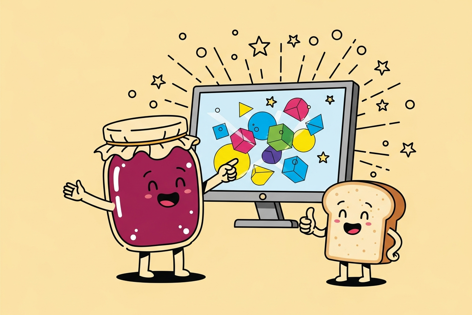
The best-converting hero illustrations depict something specific — a real user scenario, a concrete outcome, a recognizable workflow — rather than abstract shapes, blobs, or generic "productivity" imagery.
"A person overwhelmed at a desk transformed into a person working smoothly" converts better than "three overlapping circles representing seamless collaboration."
The illustration needs to answer the question: "What does my life look like after I use this product?" Concrete answers convert. Abstract visual metaphors leave the viewer's brain to fill in the gaps, and brains in evaluation mode don't want to fill gaps.
The illustration style needs to match what the product category requires emotionally. A consumer productivity tool for creative professionals calls for a different emotional register than an enterprise risk management platform.
The highest-performing hero illustrations for B2C and SMB tools tend toward warmth and approachability — friendly characters, bright palettes, expressive faces. For enterprise and B2B products, the visual tone typically shifts toward confidence and precision — cleaner compositions, more restrained color, professional character design without overt playfulness.
Mismatching the emotional tone to the category (a whimsical illustration for a HIPAA-compliant healthcare tool, or a stiff corporate illustration for a consumer journaling app) signals that the brand doesn't understand its audience.
The shift away from purely illustration-based heroes toward hybrid approaches — illustration that frames or contextualizes product screenshots — has been consistent across high-converting SaaS sites.
Users evaluating a SaaS tool want to see the actual product. Illustration creates emotional context; the product screenshot provides the specific evidence the buyer needs. The combination outperforms either alone.
A common high-performing pattern: a character illustration that represents the user in the left portion of the hero section, a product UI screenshot or device mockup in the right portion, with illustrated elements that connect the two visually.
SVG illustrations load faster and render crisply at any screen size. Raster-based hero illustrations (large PNGs, JPEGs) at viewport width create significant load weight.
A hero illustration that takes two seconds to render is creating a bounce problem before the user has read a word. Performance is not separable from conversion — they're the same thing at the hero.
Illustration that fights the headline. The illustration and headline need to communicate the same message. When the illustration depicts one scenario and the headline describes a different benefit, visitors experience cognitive dissonance rather than persuasion.
Characters that don't represent the user. A B2B tool for construction project managers whose hero illustration features a tech bro at a modern desk is speaking to the wrong person. The illustration signals who the product is for. Generic character designs speak to no one specifically.
Illustration without a clear visual hierarchy. If the hero contains an illustration, a headline, a subheadline, and a CTA, the visual design needs to sequence attention correctly: headline first, illustration as supporting emotional context, CTA clear and accessible. Illustrations that compete for attention with the primary call to action reduce conversion.
Reusing the same illustration style as everyone else. A certain flat illustration style became ubiquitous in SaaS between 2016-2022. When your hero illustration uses the same character proportions, color palette, and visual vocabulary as thirty other SaaS companies, it creates recognition without distinctiveness. A distinctive style compounds in value over time; a generic one delivers diminishing returns.
Ignoring mobile. A hero illustration designed for desktop may not compose well on mobile, where the viewport is tall and narrow. The illustration needs to be designed or adapted for both orientations, or it will look broken at mobile sizes.
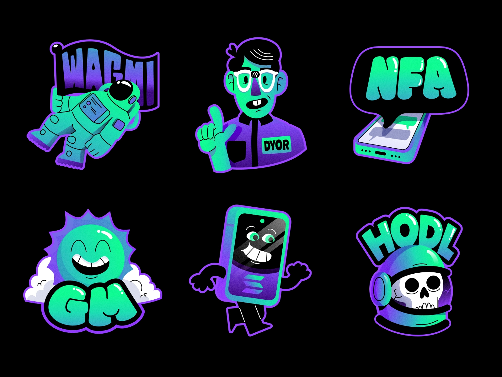
The single giant hero illustration is giving way to systems of smaller spot illustrations placed throughout the page. Small, focused illustrations positioned next to feature descriptions, inside pricing cards, adjacent to testimonials, and within feature tiles create consistent visual identity across the full page rather than concentrating design investment in a single hero element. Infographics follow a similar logic — for what kinds of content actually earn reposts and citations, see what to commission and what gets shared in infographic design.
This approach also performs better technically — smaller SVG illustrations have minimal load impact while the cumulative brand impression across the page is significant.
Jamm builds custom illustration systems for SaaS and B2B products, from hero section design through full spot illustration libraries. See our illustration work or book a call to talk through your visual identity and conversion goals.
Color choices in hero illustrations carry more conversion weight than most designers acknowledge. The palette isn't just aesthetic — it communicates trust signals, energy levels, and brand personality simultaneously.
Warm palettes (amber, coral, soft orange) signal approachability and friendliness. They work well for consumer tools, productivity apps, and brands that want to communicate accessibility. The risk is that warm palettes can read as low-stakes or casual in contexts that require conveying reliability.
Cool palettes (blue, teal, slate) signal professionalism, reliability, and precision. They dominate fintech, SaaS security products, and developer tools for good reason. The risk is coldness: a cool-palette illustration without enough character warmth can feel sterile rather than confident.
High-contrast, bold palettes (deep backgrounds with bright accent illustration) create energy and distinctiveness. These work well for brands that want to feel premium or forward-looking. They're harder to execute well because the contrast has to be calibrated precisely — too high and the illustration overwhelms the headline, too low and the visual impact disappears.
The most common mistake is using brand colors as the primary palette regardless of whether they create a good illustration. Brand blue in a logo doesn't automatically translate to brand blue as a hero illustration background. The illustration palette should be informed by the brand but designed to serve the visual hierarchy of the page.
Hero illustrations have a shelf life. The right moment to revisit one is usually a combination of design age, brand evolution, and conversion signals.
If your hero illustration was designed before your current positioning was clear, it's likely communicating the wrong thing even if it still looks fine technically. Positioning shifts happen gradually; the illustration often lags.
If your product category has changed its visual conventions and your illustration still uses the old ones, you look like a laggard. The flat illustration aesthetic that dominated SaaS from 2016 to 2022 is not the aesthetic that high-performing SaaS sites use in 2026. If your hero still looks like it was designed in that era, it's sending a signal you probably don't want to send.
If your A/B tests are showing declining performance on the hero section, the illustration is one of the first elements to test. This is especially true if competitors have recently refreshed their visual identity and your illustration now looks dated by comparison.


There's a commonly missed connection between illustration quality and organic search performance. It works through two mechanisms.
The first is Core Web Vitals. SVG hero illustrations load significantly faster than equivalent raster images at hero-section scale. A hero PNG at 1400px wide might be 600KB to 2MB depending on complexity. An SVG of equivalent complexity is often under 100KB. That load difference affects Largest Contentful Paint, one of the three Core Web Vitals that Google uses as a ranking signal. Better LCP scores correlate directly with better search performance for pages where the illustration is the largest element in the viewport.
The second mechanism is dwell time. The same quality of illustration that increases time on page also sends engagement signals to search engines. Pages with longer average session durations and lower bounce rates rank better over time than pages with identical content but weaker engagement signals. Custom illustration that keeps visitors engaged longer is, indirectly, an SEO investment.
Hire a team of top level professionals for less money than hiring a single designer. Stupid simple design subscription service to level-up your business!
Looking forward to potentially working with ya ✌️

