Branding
May 21, 2026

The average ecommerce store converts at about 2.5%. The top 20% convert at 3.2% or better. The top 10% hit 4.7% and above.
That gap sounds small. It isn't. On a $2M revenue store, moving from 2.5% to 3.5% is an extra $800K in sales from the same traffic. No new ad spend. No new products. Just better design.
So what are high-converting stores doing that average ones aren't? It's not magic. It's a set of specific, repeatable decisions.
Most online stores treat product photos as an afterthought. High-converting stores treat them as the most important design element on the page.
Here's what separates good product photography from average:
Multiple angles and contexts. Shoppers can't pick up your product. They need to see it from every angle — top, bottom, back, detail close-ups. They also need to see it in use. A backpack on a model in context converts better than a backpack on a white background every time.
Scale reference. This is underrated. If your product is furniture, jewelry, tech hardware, or anything where size matters — show it next to something recognizable. A hand. A laptop. A door frame. Shoppers who can't gauge scale don't buy.
Zoom functionality that actually works. Not a low-resolution blur when you hover. Genuine high-resolution zoom that lets someone inspect stitching, texture, or finish. The more tactile your product, the more this matters.
Video and 360-degree views. Stores using product video see higher conversion rates across categories. A five-second clip of a product being used communicates more than ten photos.
Consistent visual language. Every product should look like it belongs to the same brand. Inconsistent backgrounds, lighting, or image quality erodes trust — even subconsciously.
Before anyone spends money on your site, they need to trust you. Most stores underinvest in trust signals.
The effective ones are:
Reviews, displayed prominently. Not buried in a tab. Not hidden below the fold. On the product page, near the add-to-cart button, where someone is making a decision. Star ratings alone do less work than a few verbatim quotes from real customers.
Clear returns and shipping policies. Shoppers want to know: "What happens if this doesn't work out?" If the answer requires hunting through a footer link, you're losing conversions. Put shipping timelines and return terms directly on the product page.
Social proof at scale. "Over 40,000 customers" or "Featured in Vogue" or "Recommended by dermatologists" — third-party credibility makes a difference. Display it where doubt is highest (near price and add-to-cart).
Payment security indicators. SSL, accepted payment methods (including BNPL options), and security badges near checkout aren't flashy design elements. But their absence creates friction. Research shows BNPL options like buy-now-pay-later can boost checkout conversion by up to 30%.
An actual human face. Founder story, team page, Instagram feed of real customers — anything that reminds a shopper they're buying from real people. D2C brands that build a personality outperform anonymous storefronts consistently.
Cart abandonment averages around 70% globally. On mobile it's closer to 79%. The gap between adding to cart and actually buying is where most ecommerce revenue gets lost.
High-converting stores reduce that friction systematically.
Persistent cart. If someone leaves and comes back in a different session, their cart should still be there. Losing a cart is losing a customer who was close to buying.
Mini cart or slide-out drawer. Full-page cart redirects interrupt the shopping flow. A slide-out mini cart lets someone add an item and keep browsing without losing their momentum.
Progress indicators. Show shoppers where they are in checkout — not a blank form that seems to go on forever. "Step 2 of 3" reduces abandonment because it makes the finish line visible.
Address autocomplete. Type in a ZIP code and have the city/state fill in automatically. Small friction points like manual address entry compound across thousands of checkout attempts.
One-click upsells and cross-sells — done right. "Customers also bought" on the product page, not an interstitial popup that blocks the checkout. Aggressive upselling during checkout increases abandonment, not revenue.
Mobile drives 70–75% of ecommerce traffic. But desktop still converts higher than mobile at most stores — 3.2% vs. 2.8% on average — which means most stores are losing conversion on their primary traffic source.
The design decisions that close that gap:
Thumb-friendly tap targets. Buttons that are easy to tap with a thumb, not a precision stylus. Minimum 44px touch targets. Navigation that doesn't require pinching.
Images that load fast. A 1-second delay in mobile load time reduces conversions by 7%. On a $5M store, that's $350,000 per second of delay per year. Use next-gen image formats, lazy loading, and CDN delivery.
Simplified mobile navigation. A full desktop mega-menu on mobile is a disaster. Design the mobile navigation separately. Filters and sort options on category pages should be in a bottom sheet or drawer, not stacked above products.
Streamlined checkout on mobile. Apple Pay, Google Pay, and Shop Pay exist precisely because typing a 16-digit card number on a phone screen kills conversions. Prioritize express checkout options for mobile users.
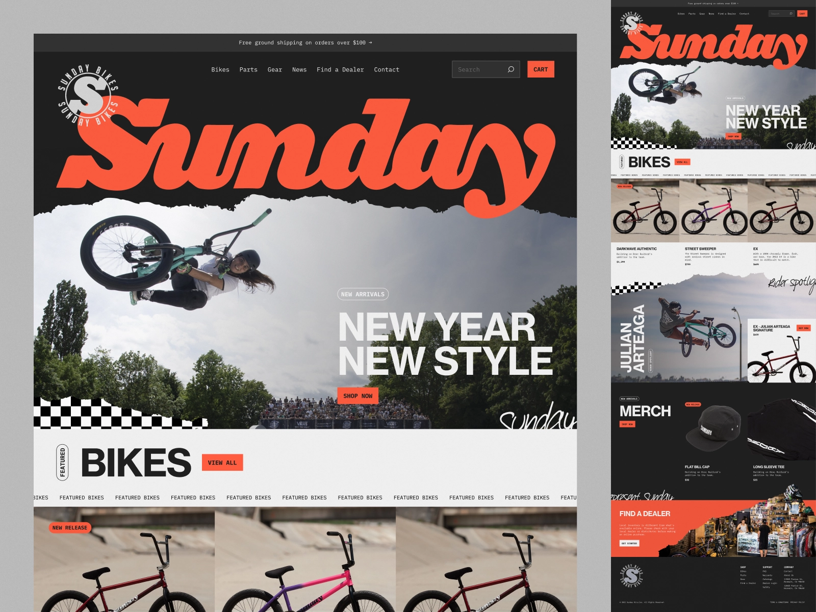
Here's what a polished ecommerce experience can look like — clean layout, strong product presentation, clear hierarchy:
And a restaurant/food service example showing effective visual merchandising and trust building:
Both of these demonstrate the same principle: every design decision is in service of reducing doubt and moving the shopper forward.
You've done everything right. Great product photos. Strong trust signals. Clean cart experience. Now someone is literally typing in their credit card. This is where average stores fumble.
Fewer fields = more completions. Ask for only what you need. Do you actually need a phone number? A company name? An "Address Line 2"? Every optional field that looks required creates hesitation. Use smart defaults and autofill wherever possible.
Guest checkout. Forcing account creation before purchase is a conversion killer. Let people buy as guests. You can ask them to create an account after the purchase.
Error messages that help. "Invalid input" is useless. "Please enter a valid email address (example@email.com)" is helpful. When forms fail, explain why and show users exactly what to fix.
Order summary on the checkout page. Shoppers need to see what they're buying while they're entering payment info. A persistent order summary sidebar (desktop) or expandable summary accordion (mobile) reduces doubt at the finish line.
Fast confirmation. The moment a purchase completes, confirm it clearly. Order number, items, email confirmation coming. Dead air after clicking "Place Order" triggers panic and chargebacks.
High-converting stores aren't just better at individual design decisions — they have consistent visual systems that make everything work together.
Typography hierarchy that's readable at small sizes. A color system where the primary CTA button always looks the same so shoppers know where to click. Component libraries where product cards, review sections, and trust badges follow the same patterns across every page.
This is where design subscriptions like Jamm earn their keep. Unlimited requests, flat monthly rate, ~2 business day turnaround — meaning when you want to test a new product page layout, try a different CTA position, or design a seasonal promotional banner, you're not starting from scratch or spinning up a freelancer. You make the request and it gets done.
Most ecommerce brands hit a wall where they know design improvements would drive revenue, but the operational cost of executing those improvements — briefing freelancers, managing projects, QA — eats into the margin. Removing that friction changes what's possible.
Ready to see what your store could look like with a dedicated design partner? Book a quick intro call. Or go straight to our subscription plans.
The stores that compound their conversion rates over time aren't the ones that ran one big redesign. They're the ones that keep shipping small improvements — better product images, sharper copy, cleaner checkout — every month.
Design isn't a project. It's an ongoing advantage.
Hire a team of top level professionals for less money than hiring a single designer. Stupid simple design subscription service to level-up your business!
Looking forward to potentially working with ya ✌️

